Friday, July 31, 2009

Another Prayer Kneeler Idea!

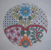
I've been going through my old old files on Cross designs, and found this one I had forgotten about. It was painted for a customer for the Episcopal Book of Common Prayer, and the design was adapted from a Faberge' egg. (I was in my Faberge' phase at that time)

As I remember, the egg was a miniature, and was the cloisonne' enamel that I enjoy designing from. This one is on 18 mesh canvas, but if put onto 13 mesh, as it is stitch counted for symmetry, it would be a lovely center for a personal prayer kneeler.
You never know where you will find inspiration for designs! This was from one of my favorite books on the subject - "Faberge and the Russian Master Goldsmiths."

I also made Christmas stocking cuffs adapted from an Art Nouveau tea service in the same book. The tulips were red, so I also got a fine ornament or two from the same pieces. I think the one that's a ball is shown in a previous post quite some time ago, and under the label "ornaments."

Sunday, July 26, 2009

More Pretty Things: Beads with Mindy (Working Again)

Working on the Mindy canvases again, this time the "#3" as I call it. After a lot of relaxing and mindless outlining in preparation for adding color, I decided it was time to do beads on the flowers, and started with the purple one.

It had to be outlined first, of course, and then the skipped basketweave worked in the three lighter shades. As always, the basketweave stitches were placed on the warp threads (the bumps), leaving the dips of the weft threads for the beads to nestle down and not wobble on top of the work.

Again, I'm using totally DMC cotton floss for this, so stitched the background of the flower with the same floss I used to attach the beads. It's absolutely amazing how well the clear beads work on a project of this sort. You can see the shading, due to using the colored floss of each area. As I worked, my mind was racing ahead to how well this effect would look on an evening bag - or even a tree ornament in brighter colors on a different shape!


I went ahead and worked a little bit of the pink diaper pattern at the top of the flower, as I wanted to see what it would look like filled in. This is what keeps a project of this sort from ever being boring. Always a new area to explore and develop.

Now I'm wanting to move back to something a bit simpler, and being tired of the beads for right now, I'm looking at the lower left corner with the delightful shaded greens. I'm thinking it might be nice in plain upright stitches. This is another great thing about working with the floss - it's so versatile that I have these options, and can stay in the same family of surface texture. This is important in a painted canvas this "busy" already in pattern and color.


After working on the green area for a little while, I think it's time go get back to "Mindy II," which is the soft colored Art Nouveau canvas - delightful and relaxing with pleasant colors and plenty of simple basketweave. A change is always nice!

Thursday, July 23, 2009

Very Pretty Things!

This is one of my favorite stops every morning while indulging in coffee and blogs and other forms of delightful "creative avoidance." I wanted to share this one, as it's pure and total eye candy and a delight to behold if you like this sort of thing - I do, although I had to LOL this morning, as she refers to things from my high school and college days as "Vintage."


Do go take a look at the Pretty Things. The photography itself is as gorgeous as the things she photographs.

Monday, July 20, 2009

Back to the Beads (and Mindy)

I'm back working on the three canvases by Mindy, and enjoying every minute of it, as the colors and patterns are beautiful, and they are perfectly stitch painted - never boring.

I have only just now started working on this one, and was in the mood for something pleasant but mindless - so began by putting in the white fretwork (in Kreinik #12 braid, 032) This geometric white line effect is all over the canvas, and is a unifying element in the busy design with so many colors.

Speaking of colors, the entire canvas will be done in DMC cotton floss except for the Kreinik braid. (Also will use clear Sundance beads on the flower design.) When I chose the thread colors, I decided to use just a very slightly lower intensity than the canvas is painted. The bright pastels are lovely, but I like them a bit more subdued - not much, but a little.

This canvas is, as are the other two, a process of being able to work on separate areas as I tire of one and move on to another. This is why they never lose my interest! Wanting to see what the next area will look like stitched is what keeps me going and entertained.

The next picture is showing part of the metallic gold fret on the upper left side. I have already started filling in the purple as it travels over from the solid area. This is intriguing, as I want to see what the shaded colors look like beneath all that fretwork!

You can also see the beads and how fine they look - the clear beads applied with the background color makes them blend well. Incidentally, this canvas is worked mainly with silk, as that's what I had in my stash to begin with - some of my very favorite colors. The other two will be done in DMC cotton floss.


Next is a shot of the leaves with the gold begun. This too is a kind of mindless exercise, and then exciting to see what they look like with the threads filling in.
This is barely begun in the lower section.

The black fret is also interesting, but I have to fill that in during broad daylight - maybe even outside if I'm up to hauling my magnifier outside. Working on black on 18 mesh canvas is no longer the easy thing it used to be. Hmmmm. Anyway - more in a day or two.

I posted pictures of all three of these canvases previously, so anyone who missed it can just click on "Beads" on the side bar labels and find those.

Sunday, July 19, 2009

DMC Floss 100%! (the Purple Ornament Finished)

I didn't like the way the Frosty Rays and Flair were looking on the flowers, as they were not the right texture to stand out against the background, so I eliminated that.

What DID work was the DMC Satin Floss (4ply), as it really shines, and stands out beautifully against the matte finish of the cotton floss.

Also, against the texture of the background being done in T-stitch.

Actually, the leaves are made with Perle Cotton, but could as well be done with floss. I like the subtle shine of this because of the "ropy" twist of the thread. It does make a bit of difference.

The larger flowers on the "lace trim" across the center were made with the same white Satin Floss, but in long, slanted stitches (4-ply), and slanted in different directions to give a bit of dimension to the petals of each flower. You can see this detail if you click to enlarge the picture.

For anyone who missed my little method of stitching with floss, I have used this for about 30 years, and found it extremely helpful in preventing the little individual plies from going astray during stitching. ESPECIALLY with the Satin Floss, which is rayon, and quite slippery. (but well worth the effort) Just take the labels off the skein, open it totally out (first removing all cats from the room) and then put the two ends together. Fold the long thread over three times and cut the looped ends. This produces a long thread, about 38" long or so, but cotton and rayon are both sturdy, and I haven't found it difficult as it doesn't fray. (This long thread doubled after you take off the plies you need, will be a working thread of about 19". It seems long, but is quite easily managed.)

Then take off two plies (for 18 mesh canvas, 3 plies for 13 mesh), double it, and thread the loop through the eye of the needle. Then put the ends of the thread through the loop, and pull a slip knot up next to the eye.


This holds the plies securely, and once the stitching has begun, they will lie flat and not separate. If you make a mistake and have to undo a stitch - then you will have to cut off the slip knot. Oh well. It happens, but not often.

This ornament is extremely simple in design, but I thoroughly enjoyed working it, and didn't get bored - probably because of the four different color areas. It was fascinating to stitch just a little bit further and see how the color looked around the next band of flowers - which is one of the reasons I enjoy just drawing a design on white canvas and not painting it.

Thursday, July 16, 2009

The Purple Ornament Progresses!

This ornament has been very entertaining to stitch, as by doing it on bare white canvas, I can see color marching along like a child with a coloring book - my preference when working on my own designs.

Anyway, it's coming to life and taking shape. The arrow is pointing to where I filled in the gap between the leaves with T-stitch, which is a simple matter, but does require a bit of thought and attention. I don't usually like textured stitches on backgrounds, as they do get a little messy around design, but in this case, the stitch is so small scaled, it didn't interfere visually.

The second picture is a detail, showing (where the arrows point) the fact that the outlining of the flowers is accomplished by stitching across the tops, and then separately, across the bottoms - much easier and more efficient.

More flowers are outlined in the third image, and the arrows are showing the direction of the tent stitch outline. This is one place I "break the rule" and turn the canvas so as to make the tent stitches stay smoothly oriented instead of letting them "sawtooth" (which is typically the look of needlepoint). It simply makes a smoother, neater edge for finishing, and keeps the textured background stitches confined and not ragged looking. This is simply a matter of switching direction about halfway across the straight edges at the top, bottom, and sides. Very simple.

The arrow pointing to the bottom of the flower on the left shows the progression of stitching across the bottoms of the flowers for the outlines.


With the fourth color begun and more color on the flowers with the centers and leaves, it's really looking fine!!

This is what makes me keep going rather than abandoning the whole project! Now for filling in the flowers, where I'll use Petite Frosty Rays and Flair - the rest is in DMC cotton for the matte look I wanted, and the Satin Floss for the centers for some shine. More tomorrow (maybe, if I don't get sidetracked) There is still the red one with the PVV and beads! Also, I hear the Mindy With Beads project calling.


Saturday, July 11, 2009

Ornament Progress: Before and After Beads!

It's rather incredible how different these two ornaments are when stitched with different threads and in different colors. Starting with exactly the same drawing on canvas!

The red one is coming to life with the addition of the beads, which glitter and sparkle in person. A close-up of this (click on it to enlarge) shows the basketweave on the flower petals done on every other row to accomodate the beads.

I could have used red beads, but am very fond of the way the clear, hexagonal ones look, as it 's more like ice crystals on the velvet of the background. The flower centers are DMC Satin Floss.

I drew another one for stitching with the pink and purple threads, as I don't like working on my own painted canvas - it's easier to see this way. The background stitch is T-Stitch, which has a nice but not overwhelming texture, and it's done with DMC cotton floss. I ordinarily use 4 plies, but in this case, I used 5, as it's on a white background, and the canvas is prone to show through with this stitch. Anne Stradal calls it the "dandruff effect," and neither of us is fond ot it. If I had worked on the painted version, I would have used 4.


As mentioned before in the previous post, the outline should always be stitched first, as it makes a clean, smooth edge - particularly when using a textured stitch like this. It gives one a definite place to start and stop - much easier and no ragged edges.

I wanted this version to contrast totally to the tree ornament red one, and I think it does. The cotton floss is matte, and the pearl cotton used for the leaves makes a nice, contrasting bit of shine, as does the Satin Floss on the flower centers. The petals are made with Rainbow Gallery Flair, and the large flowers will be made with Petite Frosty Rays, for a bit of difference against the background.

Again, if you missed it, the pattern for this ornament is on Freebies, etc., and is available for anyone to print out and use.

P.S. on this one: If I were stitching the "red" one with a white PVV background and red flowers, I would definitely use red beads on the flowers.

Wednesday, July 08, 2009

Choosing Colors, Thread, Textures - the Difference it Makes!

This ornament is one I presented on Freebies, Etc. a while back, and also is to be used in my e-book on "Laces and Trims." It's such a simple thing, and I thought it would be a good one to illustrate how a change of color and using different threads, etc. can entirely change the look of a piece.


I don't paint things I'm going to stitch myself, as I'm too lazy to take the time, and also, I love the way it develops on the blank white canvas - kind of like painting. The dots I added are for the later placement of beads, which will be the clear Sundance #250 hexagonal ones for the glitter they produce - will also use them on the white flowers.

I'm using Petite Very Velvet, and also the Kreinik 002V braid that's so pretty with it. As always on shaped ornaments, I outline the shape first so it will have a smooth edge for finishing.

This ornament is to be used either as a tree decoration, or as a kissing ball mounted over a styrofoam ball to hang for a party decoration, or maybe just to sit on a table and look sparkly and cheerful at holiday time. Actually, the ball could be two sided, as this project is quick to do, being only 4 1/2" diameter. Also, by drawing it yourself on canvas, it's quite inexpensive.

Incidentally, my first thought was to do it in white PVV with red flowers - other color combinations are certainly feasible.

The second picture is of one I painted to show what color choices can do. I haven't had time to even think about stitching it, but when I do, I'll draw it on blank canvas rather than using this painted one.


I'm using cotton floss here, probably in "T-Stitch," as I want no sparkle, and will use petite Frosty Rays for the flowers in either bump stitches or long, slanted ones. The leaves and centers will be stitched with DMC Satin Floss, as I like the idea of having the shine as opposed to the matte finish of the cotton floss - interesting effect. Also, using pearl cotton for the flowers would be great visually! Due to the "ropy" spin, it has a sheen of its own.

If you haven't visited my Freebies, Etc. blog, this ornament is under the label "ornaments" (of course) and you can print it out and draw it for yourself. Also, I posted some Halloween napkin rings today, along with four with "jewels" on them. These too, can have major character changes due to a change of threads and colors - Try it!!

Monday, July 06, 2009

Needlepoint Now: A New Issue, a New Look

I received my advance copy of the magazine today (my birthday), and was so excited when I took it out of the envelope, I had to e-mail Elizabeth (the new owner/editor) immediately to tell her how gorgeous and classy the cover is - and then it was off to the 'frig for cheese cake to enjoy while looking inside.

After looking at every page and every ad, I'll have to say it's the best issue I've seen in the two years + I've been writing for it. Even my article was decent, and it usually bores me - she and her editors made it look good!

Of course Liz Morrow's gorgeous bargello was wonderful, as was Rosalyn's "Joy of the Painted Canvas" - and Ann Blalock is back with her wit and humor to make us laugh at ourselves.

I will say that if you have let your subscription lapse or haven't bought Needlepoint Now in a while - do take another look. I'm excited about this and future issues, and will try harder, also, to make my contribution more interesting.

Sunday, June 28, 2009

Choosing Threads: a beautiful Lighthouse finished

Anne Stradal (The Cape Stitcher) has now finished this beautfiul lighthouse, and as always, gives a simple but detailed explanation of why she chose which threads and stitches. She is a master at this, and never suffocates a canvas with too much.

I enjoy watching the process myself, and highly recommend anyone's watching closely as she explains it and develops her canvas.

Thursday, June 25, 2009

Mexican Tiles in Needlepoint

Returning to one of my favorite sources for needlepoint design - the Tiles of Mexico, including the beautiful Spanish Talavera, which are manufactured in Puebla. (Uriarte)

Going through my rolls of painted canvases hidden away in boxes and on closet shelves (painting models for a number of years), I found this one that I had actually intended to stitch. I usually do just one square, as they are pretty enough alone - quick to do, and make great little pillow insets or purse patches. (at 5" square) This one I could see as a long, rectangular inset, and rather interesting.

I have loved Mexican pottery since I was a child - but oddly, when I was living in Mexico City long ago, I was apparently interested in other things, and didn't even realize that gorgeous Spanish Uriarte Talavera was in Puebla close by - just over the mountains. I went there often, and never even saw the ceramics.

These tiles I'm showing were in a book on old tiles from San Miguel de Allende (another of my haunts, but I was doing papier mache' back then, and the Jeanne Valentine factory was there)

Anyway, these lovely works of art can stand on their own as a single piece for needlepoint, or in arrangements of multiples. Four is great for a pillow, and the look; as with Patchwork patterns, is different according to how they are put together.


I had to make copies of color scans of the original canvases, as those are long gone, and then cut them up - soooo they don't quite fit, as you can see. You get the idea.

The second design is one of my very favorites, and I have stitched the single square for myself - but have no idea where it is. May have to do this one again for myself, but as the full four-square pillow that is 10 1/2" square. I have made the tiles all 5" square, but like the effect of leaving two threads between them to give the effect of grout.

I prefer the arrangment of the dark elements in the center, but changing them is certainly an interesting effect.


The last photo (the paper squares don't fit) is really pretty as just a single tile - but also interesting in this format. I tried putting the bright flowers in the center, but somehow it didn't look quite right.

I'm preparing a "tutorial" right now (Drawing on Canvas 202) that I hope to have finished by this evening on drawing a tile on canvas - I've chosen to use the first illustration, as it's simple to do, and will lay the foundation for your doing your own. Also remember that the same technique applies to putting together patchwork squares to form different effects!

If it isn't up tonight, do see it tomorrow (Friday) on Freebies, etc.

ADDENDUM: Due to an internet problem, I only finished putting the "how to draw your own" instructions for the Mexican tile (illustrated at the top) on Freebies, etc. It's ready now!!


Wednesday, June 24, 2009

Lighthouses and Rugs in Needlepoint!

New projects just beginning with two of my favorite designer/stitchers to watch with my morning coffee - and learn something new in the process. If you don't already watch these two ladies work, go see them.


Jan is just now starting this - still in the planning stage, as she explains in detail not only how she develops the design for needlepoint, but gives the history behind the actual rug - the region of Morocco that produced it, etc. Extremely interesting, as well as beautiful. You can see her at Thread Medley - her blog.


Then - Anne Stradal is just about to start showing her stitching on this unusual and awfully pretty lighthouse. She also gives the history behind it, which makes lighthouses come alive when I study her blog - and makes them more interesting. As Michaelangelo said, "I am still learning." Go see Anne at The Cape Stitcher.


Monday, June 22, 2009

Silk Ribbon & Crazy Quilt: A Heart for August

I finished this last night, except for the beads, but Google was tired and wouldn't let me post the photos of the details of the white flowers.

Looking at it this morning, I'm not totally happy with these posies, and may take them out and do it again. One of my pictures had some little white generic looking flowers, and that touch was perfect to "cool off" the bright warm colors of the Glads. I have a different effect in mind, but still using the white flowers.
The first thing to do was to place the flower petals where they should go - and these are simply straight stitches with 4mm white silk ribbon.

I usually, for attempting good symmetry, make three in the form of a "fly stitch" and then fill in the gaps with three more. - Perfect symmetry wouldn't look hand made, so fortunatey, I'm a bit clumsy at it, a they are far from perfect. It's a good idea, always, to use a trolley needle or #18 tapestry needle under one petal while the next one is being made, to avoid pulling it all the way down and causing it to be skinny and disapper.


The illustration demonstrates the ease of making a simple flower petal - there are five here, but I like the look of six or more when using 4mm ribbon, unless a specific variety is being done.


This detail of the beading in progress also shows the centers and leaves of the white flowers. Centers are made with one ply of Soy Luster in yellow - two wrap French knots, and then on green one in the center.


The beading detail is to show how much difference the beads make in dressing up the "fabric" of this patch. You can see where the spaces are in comparison to the part already beaded. I used Sundance size 14 beads with a faint greenish tinge. My first thought had been to use peridot green beads, but that would have been very distracting with the chain of jewels that is the seam treatment. Orange beads wouldn't do either.


The ones I used here are from the category "silver lined" (which you can find on their web page), as they gleam and shine, but don't sparkle or glitter - an effect I like very much. Nothing here should sparkle but the Peridots!

My daughter had a party yesterday for the birthday of her Mother-in-Law, in addition to celebrating Father's Day - so here is a vase of flowers I found in the living room this morning. Good timing??

Sunday, June 21, 2009

August CQ: Sword Lily in Silk Ribbon

"Sword Lily" sounds very exotic, but I had always known this flower as Gladiola, which I've just learned is the botanical, and not the common name. It's the flower for the month of August - and I have procrastinated for nearly a year finishing this one.

I was as intimidated by this one as I was the sweet peas for April. I had sent the picture - the one that is almost hidden, to Jean at River Silks, and she was wonderful at choosing the colors for me - really beatiful!! The 7mm was what was required to get the effect I wanted, but it's always a surprise when they take on a character of their own - usually not what I intended.

Anyway, armed with these photos and my beautiful ribbon, I started about two days ago to embellish and enhance with SRE. On this one, as well as the April birthday heart, I won't say it was "instant gratification," as I struggled a bit with the flowers to make them work.

The background patches have been finished since the end of last July, but I hadn't done the seam treatments yet - so that had to be accomplished. In this case, they needed to be simple and not compete with the brilliant colors of the flowers. The chain of peridots is quite effective, I think. (my daughter's birthstone).


To begin the embroidery, the leaves for the flowers had to be done first - in 4mm green ribbon. I used the Japanese ribbon stitch, which was shown before on the sweet peas, but in this case, instead of leaving the small loop at the top, it was pulled all the way through to produce a folded, very sharp end on the leaf. I spaced the leaves, as I wanted to use three shades of green, inserting them between the dark ones, which were done first.

Next, the gladiolus flowers! I started at the bottom with the 7mm ribbon, and made big, loose 3 wrap French knots, pulling them progressively a little tighter as they went toward the top. The arrows point to the unopened buds at the top of the "spear." Against the blue patch, I had already made Fly Stitch around each little bud - you can see where the other arrow points how it looked before Fly stitch. Soy Luster was used for this - 2 plies. It's soft, flexible, and so great for this purpose.

The next detail photo shows the flowers completed.
This is enough for tonight. I'm almost finished with the little white "field flowers" that were needed on the lower orange/pink patch - and I've also begun putting beads on the yellow patch, and almost finished with that - tomorrow maybe!

Friday, June 19, 2009

Beads on the Painted Canvas: more Mindy!

Working on these again, I know now why I didn't start on this beautiful thing when I bought it over ten years ago. I hadn't yet discovered the Kreinik 002V braid, nor had I started using so many beads within the fabric of the needlepoint.

I had to have it, as it is so fine in design, color, and painting, but just couldn't quite figure out what to do with it. Thirty five years ago, I would only have had wool or cotton for it, and no metallic. YUK. Anyway, this is the sort of canvas I enjoy so very much, as it never gets boring - there are so many areas to skip to when I tire of one, and it's fascinating to watch it develop and come to life.

As I have shown this canvas before I started stitching - we'll start here. You can see where I marked the dots for placement of the beads - and am just working basketweave around them. (silk on this one, as I already had the colors - some of my favorites.)

The next picture is a detail of the gold outlining - it's quite striking! This is an example of why I never get bored with a canvas like this one. Always something else to do on it when I tire of one activity. It's exciting, after getting an area outlined, to go ahead and stitch in the color - and move on to another area and do the same thing.

Outlining has never been my favorite thing to do, although my sister enjoyed it a lot - more challenge, she said.. I prefer the mindless activity of background and other design areas of basketweave. What will keep me going on the gold on this, is, for example, that beautiful area on the lower right where I'll fill in all those yummy colors that blend into each other.


And now the beads!! This water effect would have been too plain just worked in basketweave, but the canvas absolutely would not tolerate textured decorative stitches - would be an eye shattering mess to do that. By using these clear beads, applied with floss in the background colors, it has just enough surface texture to be interesting. Beads in the same colors as the background areas would be too much. This way, the effect is subtle, and it just looks like a bit of sparkle on the surface of the water. (my favorites, of course, Sundance #250.)

I have no restraint when it comes to Mindy's designs, so decided I could have one more - justified, of course, by the fact that I'll probably show them in a future article for Needlepoint Now - being optomistic that I'll finish all three I now have.

This will be worked the same way, as it's very busy in pattern - the clear beads on the flowers, and cotton floss on the background. Kreinik metallic braid #032 will be the outline, as it's white, and the sparkle is needed, I think.

The DMC colors are absolutely beautiful for this. The matte of the thread will also show up the beads well, and let them shine. As I had no sillks in my stash in these colors, I was able to get all new threads in cotton for it, which was my original preference anyway.
Please do go to Mindy's web page and see her other fine things. I didn't realize it until I spoke with her, but she has been around as long as I have - close to 40 years, and has her own store, as well as her wholesale to shops around the country. See her at Mindy's Needlepoint Factory.
Also, if you haven't used beads on the painted canvas yet, I have put my original book on Beads! into two chapters under e-patterns (to download and print out) on my web page. This method is so simple, and something I really enjoy doing - not at all complicated.
The book itself has also been revised to include both chapters and the variety of projects I 've done since it was first printed - and lots and lots of colored pictures. You can see it on Elegant Whimsies.

Thursday, June 18, 2009

Finding Color Schemes

While I'm having an acute case of PPD (post project depression after painting two major canvases) and resting my poor aching back, I was looking through a neglected stack of magazines. I subscribe to a number of the "better" decorating publications, which is a habit I acquired in Interior Design school, as the images are great to imprint on the mind, and it's a good source of information about color and furniture trends - fabric patterns, etc.

I found this gorgeous page in an issue of VERANDA from last November./December, and saw immediately a color scheme for a new piece of bargello I've been wanting to do. As I've mentioned before on this subject of choosing color schemes, the art directors of these magazines - and in this case, whoever designed this beautiful ad, certainly know what they're doing!

This is a "complementary" scheme, meaning that it uses the red and green, which are opposites on the color wheel. The two colors are used at rather low intensities, which when mixing paint or dyes involves just adding a bit of green to dull the red, and red to dull the green - which makes them very compatible - complementary isn't easy to work with. Even the brown, as you see it, is very very low intensity (dull) red, which means green was added to it until it's almost neutral - that's why it works so well.

What makes the scheme interesting is the different values (light and dark) of the colors. These are things you don't really need to know as you select a scheme that's already been done - I just analyzed this one to illustrate what it is.

I keep file folders of color schemes, furniture arrangements, fabric patterns - all those things, as they are a great aid for me in designing decorative accessories. Not to copy them, but as inspiration and to keep up with trends.

I'm already getting out the cotton floss to put this color scheme together to use for something - probably the bargello I have in mind. Of course it will benefit by the addition of something sparkly, and something shiny as well as the cotton.

Tuesday, June 16, 2009

More Church Work!

A friend took this photo and brought it to me - it's a Communion Server's bench that I designed for Church of the Good Sheperd here in Austin apparently five years ago, as 2004 is the date on it. (I couldn't remember)

It was a gift to the church from the senior Sunday School class that year. I used the theme of the grapes, as on the St. Andrews kneelers - and the chalice was taken from an actual one used by this church.
There is a gold Latin cross at the bottom, but it's hard to see, as this is a digital camera pic. from a glossy photograph my friend brought over. We aren't real "swift" with these electronic devices.
I thought this might give some of you an idea of something to do for your own churches. Also - I'm busy with other things, and haven't anything new to post right now. Maybe in a day or two.

Sunday, June 14, 2009

A Beautiful Quilt - both "Crazy" and "Sane"

The very first crazy quilts that really inspired me to adapt to needlepoint (since I studied the Victorian quilts in the 70's) were made by Allison Aller of "Allie's in Stitches."

I found her, and also Sharon Boggon (Pintangle) when looking for the vintage crazies, and it only took me a short while to become really addicted to this new art form. Her "Crazy for Flowers" was in progress then (an award winning quilt that year), and I was enchanted and hooked, although departures from tradition are difficult for me sometimes.

This morning I found that she has started a new quilt, and is using this one - a vintage quilt that combines both "sane" and "crazy." It clearly demonstrates, of course, the difference in the terminology, and I intend to follow it every step of the way, as she will embellish it in her own way, and I'm sure it will be enchanting, as is everything she does.

Art Crazy Quilts are fascinating to me, although I am not fond of hand sewing - or the labor of backing, etc. - all the things that go into finishing one, so for handwork I stick to knitting and needlepoint. Of course there is always the consideration that I will find something to adapt for a new needlepoint design. (Allie says she will convert me yet.)

Anyway - if you haven't already begun to follow this blog, do go take a look, as she is at the very beginning of making this quilt, and her tutorials are great - very clear and easy to understand.

As a designer, I find that I enjoy these fiber arts blogs immensely - especially the crazy quilters. There is a lot of inspiration through beautiful images that seem to imprint on the mind, and it was with these lovely quilts that I became interested in silk ribbon embroidery about 10 years ago.