Showing posts with label basketweave. Show all posts

Sunday, October 17, 2010

The Celadon is Finished!

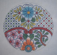
I have shown this canvas a number of times in the past few years, I think, and also the bowl (Chinese Celadon, ca. 1820) from which I took the design. The bowl was a gift from my son a long time ago, and he asked me to design a needlepoint piece for him for his office. Since this time, he has gone into private practice and started his own law firm, and moved his office three times. Oh dear.

I hang my head in shame, as the date on the canvas is 1996. I decided about a month ago not to touch any other stitching until I finished this one - and I did enjoy doing it. It is entirely basketweave, with outlining, of course, as no textured stitches would do on a design like this.

It was never boring, as there were plenty of color changes to move on to when I got tired of one activity - could just go to something else. If I tired of outlining, I could then work on the background.

It was very very rewarding to realize I had finished one of my large, classic pieces (15" diameter on 18 mesh canvas), that will still be beautiful and "in style" many years from now. Nothing trendy here, just timeless elegance, as are the Oriental porcelains. It is actually, the ONLY one of my classic big pieces I ever finished. I've had hopes of doing "Nellie's Imari," but that won't happen.

When I was wholesaling nationally, I really got tired of looking at them, so never had any desire to stitch one. I remember when Marnie Ritter (Fessenden in the '70's) was teaching via EGA on one of my smaller Celadon pieces - beautiful job of enhancement before that was being done! - she graciously reserved me a canvas and kit when she was in San Antonio at the Yarn Barn. I loved sitting in on the class that week, but declined the stitching, as I told her I had painted and inspected so many of them (close to 300, as I remember,) that I couldn't bear to stitch one too. Now I regret that I didn't.

I used DMC floss on this canvas, as I started it before I had seen the silks now available, but the cotton did a beautiful job. Also, I had the advantage of the gorgeous Kreinik 002V braid for the "coins." Back in the 70's, when I was producing so many of the Imari, Celadon, etc., we had nothing but Persian wool and no metallics. YUK.

This photo was taken in haste, and with not so good light - but I wanted to send Joe the pic to assure him this is really really finished. It will need light blocking - and then off to a wonderful framer for a double mat and non-glare glass. I'm sure it will have a place of honor in his office!

Monday, September 13, 2010

Needlepoint for Beginners: Basketweave

Actually, I'm wondering what constitutes a "beginner." There are total beginners who have never stitched with needle and thread on canvas at all - and then there are those who have done lots and lots of counted work, but never a painted canvas. I am amazed that people are afraid of it, but if all they've seen is the "goopy" messes so many people make, it's understandable. Fortunately, it's not required

I would say that either one needs to start with the very basic foundation stitch of needlepoint - basketweave! This is a greatly misunderstood stitch, but it's the one that teaches us how to regulate the tension of our work, and also to fill in parts of a painted canvas where it's more appropriate than textured stitches. It's repetitive motion is also very soothing.

Basketweave is called that because of the way it looks on the back - like a simple woven basket. It's another name for "diagonal tent" stitch, as opposed to the horizontal tent stitch, which is called "continental." An aside is that continental should never be used on mono canvas, as it makes a flimsy fabric, and has ugly horizontal ridges - it also distorts the canvas, and actually serves no purpose. and it's BORING.

This stitch was used by Victorian ladies (and my grandmother) on penelope canvas with pre-worked design. The double stranding made it possible to split 10 mesh canvas into 20 threads per inch for fine pattern.

The second picture shows the look of the basketweave on the right, and continental on the left - you can clearly see the difference. I took these pictures from a post of two years ago - lots of posts under "beginner needlelpoint" if you click on the label. I didn't have time today to do fine new swatches.

Another reason to begin with basketweave is that you get a "feel" for what is called "traveling" - the direction of making stitches properly for the most attractive effect as well as as, again, the repetitive motion that is soothing to us. I have seen some rather poor instructions for this in some of the more poplar books of stitches, although the stitches themselves are great!

There is one book that is supposedly one of the best that actually states that "basketweave can't be done in small spaces." This isn't true. See my little candy corn to dispel that myth.

It also says to come up in the center hole and go down outside when making Algerian eye - common sense would tell anyone this is not a good way to "travel." BUT the stitch collection is superb, once a person has learned technique.


The next picture of the candy corn is the little first medallion on the napkin ring finished - I can remember beginning students being upset by the strange shapes and the "sawtooth" edges on diagonals, but this is a characteristic of needlepoint, and is fine.


Note that the candy corn is stitch painted and perfectly symmetric. Think what a mess this would be if it weren't!!

I chose Petite Very Velvet for the candy, and surrounded it with black YLI Ribbon Floss in Shimmer Blend. I also used ribbon floss for the gold, as I didn't like the idea or the look of metallic braid here. This is YLI Honey/Copper Shimmer Blend. Great stuff!! The edging is my favorite long-armed cross stitch, which is superb for this - as well as for belts, as it rolls over easily and makes finishing simple as well as making an attractive edge.

This is where a nice repertoire of stitches is handy - not too many, as that gets confusing. One should use decorative stitches judiciously and for effect and not over-do it just the the sake of using them. These are things you can glean as you go along - see them on other people's work and ask questions. Just looking through a book when you haven't a clue what you're looking for, as a beginner, won't help. This should come gradually with experience and some good tutoring!

That's enough for now - too much pontificating here and not enough pictures. I'm off to stitch for a while.

Sunday, July 11, 2010

Needlepoint Shading: More "Flowers on Crosses"


It's unbelievablel what I'm finding when going through boxes long stored in the garage - things I thought I had lost or trashed.

This first picture is a cross on 18 mesh canvas that was painted probably 14 years ago, when I decided to do floral crosses for Spring - but they were a favorite all year, to my surprise. I have loved the calla lilies in colors, in addition to the plain white ones.

If you enlarge this, you will see how the shading is painted in very distinct areas - it "reads" as shading, but the separations in shades are distinct enough to make the stitchng easy in basketweave, as textured stitches have no place on this design..
The next one features blue irises (Dutch, I believe) and others that were blooming in my neighborhood that spring. I chose this one to stitch for myself, as these are my favorites!

On the painted canvas I sold to shops, I left the background and border without paint, so that people could choose their own color. The separating outline is metallic gold.
I chose the purplish light blue for background, as it enhanced the flowers, and brought them visually forward in the composition. The navy outline contained the whole pattern.

Again, this is too busy to accomodate textured stitches - and was delightful to work in just basketweave with silk threads. I didn't finish it, and have no idea where it is at the present time. Maybe it will surface.

When you are shopping for painted canvases, this "canvas preparation" is a very important thing to understand - as it must be easy to know exactly where to put your needle for the next stitch. A well painted canvas leaves no doubt!!

It isn't showing in my cropped photos, but I always make a little square of paint on the side in a vertical row, every time I change colors in my paint brush - this makes it easy for a shop owner to pull threads without missing anything.

The next flowered cross is just a very busy one - As I remember, my inspiration for these was the "flowering of the cross" the little ones do at Easter- When I was a child, we went up the aisle to the front of the church, and put a little bouquet of our own flowers onto a beautiful white cross. It was a very significant ceremony at Easter for children, and I enjoyed watching my own little ones in later years doing this.
The last picture is, again, a very busy pattern. This one, however, will accomodate, and actually needs, a bit of enhancement.
The arrows at the top point to little "fill-in" things, which I would stitch first in basketweave in the light greet dots - and then put the darker green French Knots on top of that for emphasis. In this case, just doing the French knots on bare canvas would look messy.
The lower right arrows point to little five pointed leaves - and, again, I would do these ON TOP of the background basketweave in long, smooth stitches in cotton or silk - not adding a lot of different kinds of fibers, which would be too distracting.
Tiny little 2 ply, one wrap French knots would also be great, I think, on the iris "beards" and where the brown dots around the centers of the red flowers show. Again, I would stitch the background first - then add the French knots on top, as they seem to lie flatter that way, and also add some extra dimension.
A carefully drawn and painted canvas is easy and relaxing to stitch! However, some might look at this and be frightened of it, as it looks daunting to anyone expecting to have to put a zillion fancy stitches on it with 25 different threads. YUK. I believe it might be why some are so afraid of stitching on a painted canvas - a whole new concept to me! It's being told to have to turn it to "goop" or an eye shattering mess that is the fearsome thing.

Saturday, December 26, 2009

Moving along with Color!

The stitching on the Talavera cross is showing progress now, as the colors make it come alive.

I've been working with yellow mostly for today's session (while watching old 50's Westerns, which I love).
The close-up shows the amazing difference just the stitches make while using the same thread. The sunflower petals and the little square things on the diaper pattern are both DMC cotton floss #3821.

The difference is that I also used Kreinik Blending Filament #028 on the sunflower. The squares in the pattern are simply floss in Scotch stitch - and they look lighter and brighter than the basketweave of the flower petals, as they lie flat and reflect more light.

I decided the flower centers in the blue ones needed to be lighter and without sparkle, so used DMC Satin floss there with no blending filament. The photo of the threads shows the versatility of this BF, as you can see that the yellow is dark, and blends beautifully with the floss. There is also a light BF, which I've enjoyed using with the next shade lighter in the floss on other things.

The green (Kreinik BF #009) looks rather dark to blend with #987 green, and I was afraid it wouldn't work for this - but it blends very very well, and exhibits a light, bright random sparkle which livens it up a lot. This shows that one needs to experiment, even if it doesn't look quite right lying on the table!!

The next photo shows the #018 Kreinik metallic - two are blending filament, and two are #12 braid. The one on the far left is just plain 018. ( I didn't have BF to show) The dark navy on the fat spool next to it is HL, and the small spool to the right of that is blending filament HL. The light one is Vintage BF. The floss is #336. (the background on this piece.) The Vintage BF is what I used with the navy floss on the square "bump" stitches in the diaper pattern.
The arrow in the close-up picture is pointing to the only one I could get the light to hit correctly to show one little sparkle. In person, it's an interesting effect, and it looks much better than it would with the darker HL version.

Monday, July 20, 2009

Back to the Beads (and Mindy)

I'm back working on the three canvases by Mindy, and enjoying every minute of it, as the colors and patterns are beautiful, and they are perfectly stitch painted - never boring.

I have only just now started working on this one, and was in the mood for something pleasant but mindless - so began by putting in the white fretwork (in Kreinik #12 braid, 032) This geometric white line effect is all over the canvas, and is a unifying element in the busy design with so many colors.

Speaking of colors, the entire canvas will be done in DMC cotton floss except for the Kreinik braid. (Also will use clear Sundance beads on the flower design.) When I chose the thread colors, I decided to use just a very slightly lower intensity than the canvas is painted. The bright pastels are lovely, but I like them a bit more subdued - not much, but a little.

This canvas is, as are the other two, a process of being able to work on separate areas as I tire of one and move on to another. This is why they never lose my interest! Wanting to see what the next area will look like stitched is what keeps me going and entertained.

The next picture is showing part of the metallic gold fret on the upper left side. I have already started filling in the purple as it travels over from the solid area. This is intriguing, as I want to see what the shaded colors look like beneath all that fretwork!

You can also see the beads and how fine they look - the clear beads applied with the background color makes them blend well. Incidentally, this canvas is worked mainly with silk, as that's what I had in my stash to begin with - some of my very favorite colors. The other two will be done in DMC cotton floss.


Next is a shot of the leaves with the gold begun. This too is a kind of mindless exercise, and then exciting to see what they look like with the threads filling in.
This is barely begun in the lower section.

The black fret is also interesting, but I have to fill that in during broad daylight - maybe even outside if I'm up to hauling my magnifier outside. Working on black on 18 mesh canvas is no longer the easy thing it used to be. Hmmmm. Anyway - more in a day or two.

I posted pictures of all three of these canvases previously, so anyone who missed it can just click on "Beads" on the side bar labels and find those.

Sunday, May 24, 2009

Cactus and Beads!!

I have two of these very small pieces - the other is a delightful prickly pear, which I'll get to tomorrow. From Sundance Designs, they are only 2 1/2" square, and absolutely charming for one who likes cactus.

They would not be suitable for decorative stitches, but do need something for a little zing, so what would be better than beads?? (in moderation on these) Also, I'll use the DMC Satin Floss for the flowers, as that will be great texture against the Petite Very Velvet I'll use on the cactus itself.
I decided that the background would be too busy with beads, so am using instead, my own version of "dotted swiss." This is simply basketweave, but where I marked the dots, I'll make an X so that a little bump will show - a very subtle way of adding texture without overwhelming the little canvas.

In the third picture, the work is progressing, with the background ready to go around the left side. I always just skip where the purple band is, and keep going to have a good continuity and no gaps in the surface.

On the left side where the arrow is, you can see the last stitch to be made in that row - a warp stitch (little bump.) The lower arrow points to the weft row that will then be started and go all the way back up the left side. This way, there will be no gaps or ridges in the basketweave where it meets itself - second nature once you understand it.

The color of the light green Very Velvet is absolutely perfect, I think - as it looks exactly like a cactus in the rock garden across the street. I chose the VV, as that is actually the surface texture of these cacti. Not exacty velvet, but matte - no shine like cotton or silk would produce.

I'll put beads on the dark green stripes, so left the weft stitches bare when I worked them. The purple fret is also done this way for insertion of clear beads, so as not to be too distracting. More on this tomorrow.

Thursday, May 21, 2009

Amoeba with Background (Needlepoint Basketweave)

This pink shape certainly looks like one of the pond scum critters I used to study under the microscope in college, except for the color. My prof always said I had the prettiest journal in the class, as we had to draw what we saw for record keeping. (I did stick to the pen and ink, with no color.)

Anyway, the shape was devised to illustrate the places people seem to have trouble with.

It might seem strange to go to so much trouble for just the seam allowance/background of an ornament, but forming good habits makes it easier to stitch effectively and produce smooth, nice surfaces in your projects. It actually becomes second nature, once you've learned properly. Also, I see people going to great trouble to make sure of a nice surface on their work - like separating the plies of silk and putting them back together, and using laying tools and frames - so it only makes sense to form the habit of stitching proper basketweave also, as this is a contributing factor.

The lower arrow shows the last stitch on that row before having to start at the upper curve, as it's actually on a warp row - only 3 stitches, but this continuity is important.

Then the stitching is continued until you hit the dark outline. The arrow points to this place, and you can see by enlarging the picture that it is a weft row.


The next picture simply shows the stitches continuing in order around the shape. NEVER turn the canvas upside down and begin stitching the little "V" shape - it will leave an ugly place in the work either as a groove or a ridge where it meets the stitches already done. This is a very bad habit, even for a small piece.
The V is filled in here - and the upper arrow on the left shows where the last stitch in the background is made on this row, as it meets the outline. The lower arrow demonstrates that there is a short row just above this that has to be dealt with before going back up on the log weft row. In the interest of time, I won't show this completed - it is only an exercise for demonstration. Just continue around the shape, and again where the arrows are, consider where to stop and start for continuity of stitching. The right side continues all the way around the curves, and the arrow on the bottom shows the first stitch that will join the two sides - a weft row.

I found this picture in a file of a piece I stitched that Tish Watkins painted - used it as a beginner exercise in an article in NN last year. It clearly shows the rose sections outlined before the decorative stitches were made, and the edges are very neat and defined. Also no confusion or ragged edges against the background, which is rather busy!

Wednesday, May 20, 2009

More Shaped Basketweave Background!

And now the second installment of stitching basketweave background around irregularly shaped ornaments! (or purse appliques or even fun shaped pillows). At the top, you can see where the weft is the next row of stitching, as the warp extended down across the outline. Stitching will begin again there and continue around on the left.

Meanwhile, the arrow on the right indicates where the next row is begun. The space between the two areas of stitching will be filled in - as you can see by enlarging the picture the direction of the warp threads from lower right to upper left.

This is actually very very little trouble, and becomes second nature when you know proper basketweave - and although this is just a little ornament, and the seam allowance isn't going to show that much, it gives one satisfaction to know the surface is smooth and pretty and well done.
The second picture shows the stitching going all the way around the outline, almost to the bottom, where attention must be paid to where the stitches meet. NEVER turn the piece upside down at this point and stitch until the areas meet - there will be an ugly groove or ridge, and it isn't necessary.. Next, I have stopped on the left where the arrow points - the stitch is the last one I can make on that side.


The stitching will be continued on the right side down to where you see the arrow - study it closely, and you will see that the warp row here extends all the way up to the left side outline, and will be a smooth joining of the rows of stitches.

The last little bit of background left to do is shown in the next picture, with the arrow indicating where to start the row.

Now it's finished - and I've begun to wonder what it is - maybe a ghost? An octopus? I could draw most anything inside and make something of it, except that I have painting to do and this is classified as "creative avoidance." Next time, the pink one - it's more complex!

Monday, May 18, 2009

Basketweave Background for Shaped Ornaments

I can't possibly stitch an ornament to demonstrate this, as time is a factor - so am just showing it with a shaped outline, as the process can be easily demonstrated this way.

I'm using two outline forms that I used to use for teaching beginners - back when we taught basketweave as the basic for fine stitching. People had to learn to stitch outlines within a design, and also odd shapes, as they needed to learn the concept of the outline stitch and having all the "tent stitches" going the same way on the canvas.

Another way I use outlines also is to enclose an irregular shape within a design on a painted canvas when it is to be stitched with textured stitches and adjacent to another area, to eliminate ragged and unattractive edges. It makes the stitching sooo much easier! Also - on any ornament, as on my circles with bargello. Leaves no doubt as to where to begin and end "fancy" stitches.
The second pictures is horribly blurry, but I had already started stitching the background before I unloaded it from the camera - but you can see where I marked three threads out wherever I could when the stitches were on the straight vertical or horizontal. After that, it's a matter of "connecting the dots" to draw the outline for the background.

As I've said, a really competent finisher doesn't need more than about two extra rows. Many designers don't add this, and I've seen stitchers and shop owners perplexed when part of the design was lost in the finishing - so I've made a point for many years of drawing the outline around the piece myself. I like the three rows, as with the light padding in the finishing, it leaves a slight bit of color around the design - kind of like a mat liner when framing a picture.

The next picture illustrates how to find where to start this basketweave background.

If you've learned properly, you will already know that one stitches UP on the weft (horizontals) and DOWN on the warp (the little bumps). This is vital to a really nice stitched surface - and also is a great way to understand where to start and stop.


The piece of paper is at a 45 degree angle, so that one can see whether the first row of stitches is warp or weft. In this case, you can clearly see (click to enlarge the picture) that the row just under the paper is WARP, so the first stitches on the curve will be on the weft where the arrow is pointing.


On the next picture, the stitching is begun, and the arrow at the top shows the weft threads where I'll start again after going down the right side. The lower arrow points to where the next thread will begin the stitches, as it's not a straight line from that curve up to where I stopped the stitching. This way, stitching up the weft will happen with no breaks - and again, the surface will be smooth.

This second shape is a bit more complicated - and will illustrate some common mistakes people make in stitching odd areas, like the "V" at the top. This one is at the "dot" stage, and then the dots will be connected for the background outline. The arrows point to mistakes I made, which I will dot out with white acrylic - or just make the adjustment with my needle and thread when I get there.


This is a choice we make when stitching - and is part of the art. We need to be able to judge whether a stitch is right to make the curve look pretty, or should not be done.

This is also a plus for the well painted canvas, that there seem to be too few of these days. The choices of where to place a stitch shouldn't be difficult. On the last picture, the arrows point to where the next threads will be started.

More about stitching in the next post - this is enough of my "pontificating" for one day.

Friday, May 15, 2009

The Art of the Background for Shaped Ornaments

I'll have to do this in two or three installments, as it could get rather lengthy - I intend to show step by step later how to effectively and easily stitch a basketweave background around a shaped ornament. I am seeing people really apparently struggling with it, and making it more difficult than it is.

A really competent finisher can do amazing things with the shaped ornament - I was mentored in this by Vikki Pinson here in Austin, who is fantastic at the art of fine finishing. I had no idea that one could actually have an intricately shaped piece finished without a wide band of background. She finished this cross for me in 1997, and was the first thing I did that was shaped and not on a rectangle.Notice that the background is very narrow - and is a dark purple, which contrasts beautifully with the colors on the cross.

There are two reasons for stitching background on shaped ornaments - one is to provide a seam allowance for the finisher, in which case a bit of it is going to show around the edges. I like to capitalize on this effect and make it a really nice color for edging. Ordinarily, two or three rows of stitching is enough.

I prefer my ornaments very lightly padded with a stiff back - rather than little stuffed pillow looking things, which are awkward and usually puckered around the edges. These look clumsy hanging on a tree or anywhere. For this reason, I add enough background color to show so that nothing is lost from the ornament itself. It's like a framework of color to further enhance the ornament itself.


This is a picture of Gail Hendrix's blowfish when I was adding the background - just illustrating the enhancing green, and the fact that the outline is added in three rows all the way around. (since it's stitch painted.)

The "jeweled" fish is my own design - an old one from my antique jewelry adaptation phase. Notice the dark green outline - it follows the shape of the fish closely, and showed up well on the finished piece as a colorful and enhancing outline on the edge. By doing this "background," no stitches from the fish itself were lost, and the shape was maintained.


The original piece of jewelry was red and green - so I changed it to blue, as I didn't want it to look like "Christmas."


The other reason for stitching background around an ornament is to give it a bit of added dimension - as sky or water or just a color to enhance the design itself.

The palm tree and parrot could have been stitched with less background and more nearly the shape of the design, but I wanted the color and definition a bit larger.


Again, here is the jewelry from which I adapted the parrot.


The starfish could have been left with only the darker green background, but I wanted the "sea water" also around it for more color. I'll add another chapter to this in a day or two, and deal with the actual stitching how-to of proper basketweave around a shape. It's actually quite simple if you've been taught correctly.

Meanwhile, also check out the other blog (Freebies, etc.), as I have some small crosses there I found that were drawn years ago for individual personal prayer cushions. People have been asking for patterns and ideas for these lately.
ADDENDUM: While looking through my bead files a little while ago, I found this small starfish ornament I made for Vikki several years ago. I can see where I painted out the outline I had originally made for the background, as she said she only needed a few rows for finishing.

You can see how intricate the outline is, and how effective it is to leave the ornament in it's actual shape. It finished quite well as a starfish with hardly any background showing. (This one was done with my technique which makes it look beaded solid.)