Tuesday, December 30, 2008

Beads, Pots, and Classic Design - a Preview

I have dealt with deadlines of one type or another for a lot of years, and usually handle them well - but this one (Needlepoint Now) kind of crept up on me, as I didn't realize how close we are to January. Time flies! Anyway, I thought I would show a preview of what has kept my needle so busy for the last six weeks or so trying to get canvases stitched and ready. I took on a bit too much stitching for this one.

I have shown this one before, but only barely in progress. The canvas is by E.T.A., produced and distributed by Sundance Designs. The Zuni Rainbird has been a fascinating study for me, and I can now recognize it's charming graphic design on the Pueblo pots in the ancient conventionalized form without a recognizable bird head. I chose to use beads, as no textured stitches would be right for it, but it needed a bit of "zing" - and I do love beads. They are also from Sundance, and are not the sparkly kind, but rather have a surface that softly gleams and enhances the design. There are beads the same color as the red/brown paint on the canvas for this design, but there wasn't enough contrast - so I used the lighter ones.

Also, on Anne Stradal's Mimbres ornaments I used the beads to enhance but not suffocate. I have already shown one of them finished in an earlier post - (see Pueblo pottery on the side bar). On this one, I only beaded the black parts of the design, as to bead the white would have been "overkill" and would ruin the effect.
The few beads sprinkled on the background are my favorite color #250, which is crystal clear - and applied with the same floss that I used on the background. It just gives a bit of enhancement to an otherwise plain field, but without distraction. These designs are timeless and elegant, and will never go out of fashion as the trendy ones do. Anne herself stitched the Mimbres insects - and I like, again, the simplicity of the stitching and fibers.


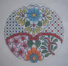
I sent the picture of Jan Fitpatrick's (Thread Medley - see it here) Moroccan rug, which is now finished - but as I have shown it before almost done, I'm presenting here a new coaster she has stitched, adapted from a tile from Marrakesh.


Also used for this "the artist's research and adaptation" article are Gail Hendrix's two Japanese Geishas ornaments, which were inspired by the lovely simplicity of the 17th century woodblock prints. I have shown the "Nippon Texures" just a few days ago - so here is the companion to it. As Gail says, they are timeless and elegant in color, pattern, and simplicity!
So much black, brown, and white, as much as I love it, has driven me back to the colorful again, and I have been busy stitch designing more bargello eggs in spring colors, which should be ready for show and tell soon.

Be sure to go "visit" these ladies on their blogs and see more - I have them listed on my side bar. Lots of pretty stuff!!

Sunday, December 28, 2008

Freebies to come: Bargello and 4-way Flowers

Playing with Bargello again today, and this time with pastel colors for Spring - an egg shape. This one is 5 1/2" high x 4 1/4" wide, and will accomodate the 4-way design for the octagonal Christmas ornament from a few days ago, as well as this new pink flower.

This is a process you might enjoy playing with yourself, and see what you can achieve! The egg shape will be on Freebies, etc. in a few days when I get finished with the stitching and make the charts - but the smaller egg will do that's already available there - or you might just play with it on a circle.

The first thing I did, of course, was to draw the egg shape, which must be perfectly symmetrical to work for the 4-way bargello. I have used, instead of my usual black drawing pen, a blue Sharpie ultra fine permanent ink pen, so that the black dots and lines won't show through the stitching - especially as I plan to use white for the background. Next, the center square was marked, as well as the vertical and horizontal centers on the background - and the diagonals, which are necessary for corner turning on 4-way Bargello.

After stitching the pink flower (Rainbow Gallery Frosty Rays), the leaves were made with Kreinik metallic ribbon - 1/16" - on the diagonals. Then the fun part began - experimenting! I simply started at the top center, but this time turning the egg on its side, as I had to make sure the entire motif would fit from side to side. The top of the point was made, and then I just kind of made stair steps to create the flame stitch bargello, turning at the diagonal line for a mirror image. I had to rip out the first attempt, as it looked rather boring.
The last picture is as far as I got tonight, but I did get the inner border started with YLI Ribbon Floss in a pretty green that coordinates well with the Kreinik metallic and the Frosty Rays of the first green border.

I started this piece by just dumping out my stash of "frosty" and shiny threads in the colors I thought would best replicate those spun sugar eggs I remember from childhood - the ones with the little "dioramas" inside when you looked through a peep hole. I remember the white egg part looked rather sparkly, so I'll use probaby perle cotton and a few clear beads for the background around the pink flower instead of bargello. The 4-way Bargello framework will represent the "icing."

Do try this yourself - you will be surprised what you can do just playing around with needle and thread on canvas! I did put the pink flower chart on Freebies, Etc. for your use - will do the whole thing later.

Thursday, December 25, 2008

"Nippon Textures" - more Gail Hendrix!

I'm very pleased to learn that Anne Stradal plans to stitch this beautiful ornament by Gail - another of her Japanese pieces inspired by the wood block prints of the Edo period by the great Harunobo.

The word "Nippon" is derived from Dai Nippon, meaning Great Japan, and the expression comes from the Chinese ideograph for the place where the sun comes from - or Land of the Rising Sun, as it is east of China, and therefore where the sun rises from. (interesting trivia here)

Anyway, Gail's interpretation of this art is superb, and her adaptation to a 7" circle of needlepoint canvas has the simplicity, grace, and beauty of the art of that era. The painting has movement by use of the lines, and the eye is led where the artist wants it to go by the repetition of colors and small pattern textures.

Anne has an excellent sense of color, and is an advocate of elegant simplicity in her choices of stitches (very few textured stitches) and the use of simple threads, with only a few of the novelties for accents - so I do look forward to watching it's progress. Be sure to watch at her blog, The Cape Stitcher!

Monday, December 22, 2008

The Subject is Bargello!!

One of the "percs" of writing a regular feature for Needlepoint Now is that I get advance copies - and what a delightful surprise, as this one arrived very very early. The day is freezing and gloomy again in Austin, so finding it in my mail box lit up my day! The cover is the most beautiful bargello I've seen in a long time - and the projects inside are, as well.

If you don't subscribe, and you love bargello, be sure to reserve a copy at your LNS for this issue - which should be "out" early in January.

and speaking of ------ I have a deadline now, so must get busy. I have a lot to live up to!!

Saturday, December 20, 2008

The Bargello Finished!

I posted pictures of this on the other blog yesterday before it was finished - along with the instructions. Just a few more hours today completed the work, as it took very little time due to the long stitches.

This is a 4-way Bargello ornament, so was worked as a square with the corners cut off to make an octagon. However, as it was lying on my table, I realized that by turning it 45 degrees, it looked entirely different - great for an ornament with a tassel on the bottom!

The design is only 4" high and wide, so works up quickly - a good project for two easy afternoons or maybe while riding in a car to a holiday destination.

Thursday, December 18, 2008

Gloomy Day Relief: 4-Way Bargello on Eggs!

The gloom/fog/cold wet stuff continues today in Austin, and I need something colorful to brighten my day. As much as I love the Pueblo pottery adaptations, enough is enough of the brown, black and white for a little while. Also, a new project - even a small one, is good for a break - and good for the soul if it is quick and colorful.

I saw recently that someone stated that 4-way bargello would only work on squares - Dorothy Kaestner failed to mention that in her book in 1972, so when I bought that one in 1974, I set right out to do the 4-way on circles and ovals for ornaments. Of course all I had to work with was DMC cotton floss, so the finished pieces had no sparkle or zing.

I decided last night to try this technique on eggs, as I need relief from the Christmas colors, and also the "season" for these things is coming soon. Besides, the colors are pretty - and I'm seeing eggs in needlepoint that look a bit like the old spun sugar eggs of my childhood.
I pulled out two different versions of a color scheme: the first one is based on the Caron Watercolours, and the second has more sparkle, with the Kreinik metallics and Frosty Rays. I intend to take "artistic license" (Cheat) and use the PVV in between the bands of bargello, and maybe add a few beads.

The next picture is back to the seasonal colors, and the circle is tiny - only 3 1/2" diameter, so I should be able to do it tonight and post it on Freebies, etc. as a finished piece (if I get the charts done).

More relief via colors is to get back to the project I've had to put down for a while - the Crazy for Birthdays hearts. This one is March, with it's aquamarines and spring colors in sight. Daffodils will be glorious on this in silk ribbon! August is nearly finished, January is coming along nicely, and April already has it's diamonds finished. This will all get finished, I'm sure - and spring will come and I can play outside again before it gets hot - at which point I'll be wishing for the cold, wet, gloom to come again for a little while. (at least the rain). Oh well.

Tuesday, December 16, 2008

Thread selections for a Study in Black and White

I've been busy today doing nothing - fizzing around and accomplishing little, but totally enjoying Other People's blogs. Take a look at Anne's lastest post on The Cape Stitcher to learn about enhancing a piece of needlepoint with excellent choices of threads - and only a few, low-key textured stitches. Very interesting!!

Saturday, December 13, 2008

Morocco in Needlepoint: Update


Jan has been working on her Moroccan rug adaptation to needlepoint, and has made some progress. There is an update on her blog - and she'll have more tomorrow, including a bit of her research into the Moroccan textiles, colors, etc. - and she will also explain the how and "why" of what she's doing. Do go and visit her at Thread Medley!
She gave me permission to show these pictures - one is her needlepoint rug in progress, and the other is the actual rug giving her inspiration and ideas. (the narrow red band, which is featured in this section)

Thursday, December 11, 2008

Another Form of Lace!

This was a serendipitous find for me - as I was cruising around in Sharon B's PINTANGLE yesterday, I clicked on a blog under her list of "R"'s, and was amazed to find yet another version of the 15th and 16th versions of filet lace.

I have, off and on in the last few months, made a rather thorough study of lace and it's origins, as I'm intensely interested in replicating the look of the Irish crocheted lace - particularly their adaptation of filet lace, which originated in Italy and evolved from the Reticella to punto-in-aria to filet.

The Reticella was originally cutwork in which threads were pulled from linen fabric to make a "grid," and then a pattern was worked mainly with buttohole stitch. Later reticella used a grid made of thread rather than a fabric ground. Both types resulted in the characteristic geometric design of squares and circles, etc. Reticella then evolved into Punto in Aria, which did not involve using the fabric, but was constructed "stitch in air" to make the netting.
Adriana Ortiz, of Argentina, learned the art of RANDA from her grandmother a number of years ago - this term refers exclusively to the needlework originating in the province of Tucuman, and is one of the oldest of the crafts, which were brought by the Spaniards to the new world in the late 16th to the early 17th century.
Do go visit this blog, Randa - Handmade Lace, and enjoy! Her work is exquisite. I had no idea this had been done - from so long ago. As Michaelangelo said, "I am still learning." Learning is a good thing!!
The lovely white pillow is for the ring bearer in a wedding - gorgeous thing, it is!

Tuesday, December 09, 2008

CQ Birthday Heart: January

Lately I've wondered if I started my Freebies blog just so I could change the header every month and use the Crazy of the Month. I just realized that for needlepoint purposes, January is almost here - and I have no CQ heart to celebrate.

During the last few days, I have started "seeing" the images in my head, so gave in to it today and made the sketches. I had already looked at images and symbolism for garnets on the internet, and have felt that only the antique jewelry would do for this. (I had a college roommate who collected antique garnet lavoliers - beautiful things!) Anyway, this one took some serious doodling on scrap canvas to get the effect I wanted. The beads were already in my stash - the Sundance size 14, color #315. For the first time in quite a while, I was unable to see a curved seam on this crazy quilt.

The next step was to go ahead and draw the heart onto canvas, and place the "necklace" - stitch by stitch. Being an impatient person, I had to stitch the gold (Kreinik metallic braid V002) and a few "jewels." The beads were such a perfect color I didn't dig any further into my stash for the garnets! So far, these are the colors that seem right for the project - but, as always, I'm sure the thing will have a mind of its own, and will dictate what goes where as the work progresses.

Carnations are the flowers, and I have chosen probably to use the traditional shades of pink and white - and will do them with silk ribbon, of course. Seam treatments will be stitched on top of the work when it's finished.

Sunday, December 07, 2008

Beads and The Rainbird

This has been moving slowly, as I have other projects going at the same time (don't we all?). Anyway, I had ordered several books for research into the Pueblo pottery when Anne Stradal sent me the Mimbres ornaments I had requested. I had absolutely no idea of the history of this pottery, or even of the diversity in the various pueblos of the southwest, but had loved the look of it since childhood when we used to spend part of summers in Santa Fe. (it was a village back then - complete with La Fonda and Indian Joe on the porch). My eyes have been opened! I now understand the little graphic motifs on Anne's, and also am able to identify "Rainbird" motifs on various pots I see - where there is no identifiable bird.

This one is a canvas I found on the Sundance Designs web page, (see that here) but since they are wholesale only, I called The Busy Needle, which is also in Tucson, to send it to me, along with some suitable beads (also from Sundance). These ladies are remarkable, incidentally, as I had the canvas and beads in hand in about two days.
I'm showing another canvas which is also a Rainbird by E.T.A., and produced and distributed by Sundance. The pot is one I found in a gallery of old ones, and I am delighted to say that I now recognize a "rainbird." I have leaned more toward the Acoma pots for my own design, but in adapting any work of art to needlepoint canvas, it certainly makes it come alive if one does a bit of study - and also learns which elements are the most important.

These Pueblo pottery designs are so classic and graphic, they would fit well into almost any decor - and certainly shouldn't be limited to "southwest." I find them quite elegant!! As for using beads on a pottery design, this one really couldn't take fancy fibers and decorative stitches, but needed a bit of zing - so of course I chose beads. They are not the sparkly kind, so don't really distract.

Saturday, December 06, 2008

Choosing Stitches and Threads

There is an excellent tutorial on Anne Stradal's blog this morning (The Cape Stitcher) on choosing threads and stitches for needlepoint projects. The artwork, as usual, is charming - and her canvas preparation is great, as she stitch paints with great care. Anne believes, as I do, that the design should be dealt with as a whole, rather than as individual parts. Too much textural interest will distract and suffocate rather than enhance.

P.S. also please notice that the circle is drawn perfectly symmetric - this not only makes the canvas look nice, but it's easier to stitch neatly. Just drawing around a glass or whatever may look O.K. before the design is stitched, but it's not good canvas preparation, as the circle usually appears a bit or a lot lopsided after it's worked, and is difficult to finish as a round ornament.

Wednesday, December 03, 2008

Beautiful Colors from Images

I have always heard that "the artist sees the world through different eyes," and I believe we do - as we SEE rather than just "look at" the world around us. It's a joy to be able to look at leaves lying in the grass, and wanting to interpret or adapt the way they look with an art medium. (In my case, this is usually watercolours, pottery, or needlepoint canvas.) I see texture on tree bark, and try to figure out how to stitch it. A cascade of flowers on a vine must be interpreted in silk ribbon. and on and on - there is a painting or design source anywhere you look, if you learn to observe and really see.

Yesterday I found a blog that's new to me, (via Jan Fitzpatrick's THREAD MEDLEY), and have spent hours going through it. Looking at beautiful images is good for the artistic soul - and anyone else's, as they seem to imprint on the mind! These pictures are from Kris's COLOR STRIPES blog, where she chooses a color palette from her photographs, and makes a gorgeous and coordinated color scheme from them - in the form of stripes.

I'm delighted to see this, as Sharon B's TIF Challenge is at an end this month, and I have enjoyed it a lot - my own challenge being to design something in needlepoint, using her chosen colors. Of course one has to also figure out which color will be dominant, etc. etc. - most enjoyable! This would also be a great help to anyone who has a problem with choosing thread colors for projects that require the "invention" of a color scheme. Be sure to go look, and enjoy!!

Saturday, November 29, 2008

An Exciting New Blog!!

Another new one to look forward to with morning coffee - or for late evening entertainment!! I was really excited this morning when Anne Stradal notified me that she has taken the "big leap" and started her blog, finally. I had been saving this lighthouse to show as I stitched (with her already telling me how to do the water), but now can use it to arouse interest in her wonderful work.

Anne sent me this several weeks ago when I was in a low spot in my life, and wanting to go back to north Florida. This is a truly great rendition of my beloved St. Mark's lighthouse. (Lighthouses are one of her specialties) I can see the alligators lurking just under the surface of the water in the 'gator pond at the bottom. Many times I have had to stop on the little dirt road you can see, while a big alligator was sunning himself for a little while. Off to the right, I can still see, in my imagination, the pier with the brown pelicans roosting on the pilings - and the boat house that was blown away by Hurricane Kate before I could do a watercolour of it. To the right, also, of the 'gator pond and the salt marsh, are some bushes that are covered with butterflies during Monarch migration - what a sight!!

Anyway - back to Anne and her blog! She has her education in Journalism, and her text is delightful and easy to read. The story of her beginnings as a designer is also rather amusing. She totally stitch paints, and has a terrific color sense as well. - Also, as a stitcher, she knows exactly what not to do as far as overkill on the decorative stitches and "fancy fibers." Very enlightening! I look forward to seeing what she is doing and why - and also, reading about her own adaptations to design on painted canvas. I was planning to do this as I finish her Pueblo pottery ornaments, but will leave this task to her now, as I would rather read about it than write it. She does it so well! Go visit her often at The Cape Stitcher.

Wednesday, November 26, 2008

Squiggee is now Stitching

Be sure, while blog hopping in the next few days, to see Gail Hendrix's latest endeavor. This is a lady, who about a month ago, was still insisting she could do nothing but basketweave with wool, as we did 35 years ago. She is primarily a designer of painted canvases - wonderful painted canvases, as they are stitch painted and otherwise beautifully done. Anyway, in desparation, as she needs stitched models to show, she decided to do her own - with accompanying stitch guides. I bravely (snif) packaged up a stash starter bag for her out of my own. (I think very highly of Gail and her work). It's unbelievable what she has worked out all by herself! Go take a look! This "jeweled" beauty is from her collection of crab frame-weights. As I don't use a frame for stitching (and neither does Gail), I would stuff it with BB's and make a paper weight for my desk.

I think this is a good example of what one can work out with just common sense and good taste - whereas too many classes contribute to confusion and overkill in decorative threads and stitches.

Tuesday, November 25, 2008

The Moroccan Rug Progresses

I'm loafing and watching movies and stitching this evening - and checking out blogs. Please do go visit Thread Medley and see Jan's progress on this gorgeous rug adaptation. I have tried to figure out how to do this for years with my son's antique woven Bakhtiari rugs (Persia) - but have failed where Jan has succeeded. This is truly remarkable, and I look forward to watching it's progress.

Saturday, November 22, 2008

Japanese Art: More Design and Adaptation

Adapting a design to needlepoint canvas is a matter of also researching the origins of that design. It is important to understand colors, symbolism etc., so as not to leave out anything important, or to emphasize something that isn't. Japanese art, particularly the antique porcelains, has been the mainstay of my portfolio since I first began painting needlepoint canvas.

This picture is of a woodblock print of the great artist of the Edo period, Suzuki Harunobu. (1725-1770) After centuries of warfare and unrest, Japan had finally settled into peace and productivity, and arts begain to flourish. Harunobu was the first designer of woodblock prints
to use a series of blocks to apply multiple colors onto a rice paper ground. He primarily made images of beautiful women and Kabuki actors. More typical of this period was a lot of negative space, which gave a feeling of serenity. (this particular print is filled, however)

I never worked from these wood block prints, as I don't do people well, and am better at doing my own thing. Gail Hendrix, however, has done some lovely canvases from them! It's easier to really appreciate and understand her design work and adaptations, knowing the source. Be sure to visit Chilly Hollow, where Jane is stitching one of Gail's canvases at the present time. Lovely thing, it is!.

Of course I had to investigate the porcelains of the period, and found the gorgeous Kakeimon, which was produced in this time period - by a man who learned from a Korean potter after a deposit of the pure white kaolin porcelain clay was discovered. There was a lot of kidnapping of Korean potters in those days, as their work was superb and they knew many secrets - and Japan was late to begin producing pottery. The Chinese had already been doing it for centuries before.

I wasn't able to do but one or two pieces in needlepoint from this style, as the design elements are rather small, and with the amount of negative space left to show the beautiful snow white of the porcelain body and glaze, it would have been extremely boring to stitch. Small pieces, even on 18 mesh canvas, were not an option, as the detail of the little motifs would not have stitched well.
In the next century, the Imari was produced and marketed - and by the early to mid 19th century, some totally gorgeous ware was made to export to the western markets. This is what I enjoyed most in my designwork. Not only is it beautful "organized chaos" with little or no negative space, but it was a joy to adapt to canvas and a challenge to maintain the design elements and put them onto canvas so that they would stitch properly. This canvas is one of a pair - the other had cranes on it, but I have lost the picture, as well as the plate I designed from. The date on them was ca. 1820. I had to make the design on canvas 15" diameter on 18 mesh in order to get all the small and significant elements.

The central "peach" (immortality or longevity) is one of my favorites. On the porcelains, it is conventionalized to usually the half navy, and half diaper pattern as on this one. The six divisions is typical of this period, and is an ancient format that also traveled the silk road through the Ottoman Empire to Spain to become the Spanish Talavera - which was Maiolica, the in-glaze firing of color into the lead white glaze that covered the red clay body - in imitation of the white of the Japanese porcelains.

The rectangle is a little over a quarter section of a pillow I designed from an Imari bowl - again, mid 19th century. It had a pedestal on the bottom with the design I took for the border. The central "flower" was in the bowl itself, and the fretwork was around the inside of the bowl. The rest of the design was on the outside of the bowl - beautiful thing! ( I sold it a while back to raise funds to buy more antique porcelain.)

Anyway - this is how a needlepoint designer goes about adapting a design from a source! I'm doing the same thing these days with the Pueblo pottery, but have much research to do first - I'm especially intrigued with the "fetish" critters of the Zunis.

Friday, November 21, 2008

Thread Medley Moroccan Style

More interesting things to come! I was delighted to see another post on Jan's new blog about the adaptation of Moroccan textiles to needlepoint - and am so looking forward to watching her way of doing this, that I'm sacrificing my lovely book on African Textiles - it's on its way to her house! I knew the picture looked familiar, and then realized it is the same style as a Moroccan embroidery I had posted some time ago.

When I was in design school a very long time ago, we were told in a course dealing with the history and development of decorative accessories, that one must never force a medium to do anything not inherent in its nature. The medium should be exploited to make the most of its own kind of potential for beauty - so when needlepoint became my own medium, which it has been for the past 40 years, I sought not to COPY a thing (in my case, mostly antique Japanese porcelain), but to ADAPT the design and feeling to needlepoint canvas. Jan has chosen, with needle and thread, to adapt woven textiles onto canvas. This is so appropriate, as the canvas itself is a woven fabric - an openwork scrim through which colored threads may be worked for wonderful effects!

She is planning to begin the research and development (lots of research!!) - and to explain the method - of adaptation of the Moroccan weavings and embroidery, so do tune in and watch the process! (See her at Thread Medley.) I also have planned - hopefully on Sunday, to explain my own way of adapting ceramic designs to needlepoint, which seem to inspire me more than the textiles do. I have been studying intensely, and with great interest, the Pueblo pottery of the Southwest, and am amazed at the history and beauty of these ceramic pieces.

The world of design is never boring, if one reads and does the research - always something new to discover! It's good to be busy.

Wednesday, November 19, 2008

A Great New Needlepoint Blog!


What a wonderful surprise it always is ( and this doesn't happen often) to find a new blog with really great and original designs. Jan Fitzpatrick is a stitching designer with an active imagination and great competence at interpretation - and is presently working with replicating Moroccan textiles. This is the sort of thing I want to see progressing daily for my coffee time in the morning. (Instead of tending to my own.) It's very refreshing to see something that is different from so many others - original, interesting, and very well done. (I think that adds up to "tasteful.")
There are actually three of these quilt block coasters showing on her blog right now, but I only got two for show - see how just change of color can make an entire pattern look different! I couldn't get the whole squares when I klepped them from her (with her permission, of course) - so do go look at Thread Medley. There is also a web page, to which I have put a link under "Good Stuff."

Saturday, November 15, 2008

T.I.P.'s and Coming Attractions

The first of the Mimbres Pueblo pottery ornaments is finished - all complete with beads, (Anne Stradal's Design - see more here), so it is no longer a Thing In Progress, but a Project Accomplished. Only two more of these to finish, unless I can manage to beg her to drop everything and paint the little canvas with the insects for me.

The mermaid (Gail Hendrix) is next, and I think I'm seeing the end of this one soon - but have thoroughly enjoyed the gorgeous colors! Since taking this picture, I have started stitching the arms and body - using Anchor floss, as I like the rather matte finish of the cotton as compared to the shine on the ribbon floss.

In this detail, you can see that I used (besides the honey/copper Ribbon Floss) on the tail, a bit of Accentuate for blending filament, along with Splendor silk, just on the darker shading on the tail fin. There is enough sparkle and shine on the rest of the figure, that making the entire tail sparkle too would destroy the effect.
The third "thing in progress" is the August Birthday crazy quilt heart that I had put aside - and now it's past time to start on January. (it's good to be busy.) I drew the arrows to point out the "seam" that isn't quite on the 45 degree angle - and also the dots I made on the patch with Hungarian Criss Cross, where beads will be placed.


The green diagonal mosaic was worked with the canvas turned, as it would not have been pretty going the other way, due to the angle not being exactly on the diagonal - but mainly because this stitch creates a strong direction, and looks much much better this way for this design.

The coming attractions include a series of beautiful little sea critters to swim with the Mermaid (Julia). The first of these on my work table, accumulating the necessary threads, is a pink blowfish, carrying quite a load of shimmering pearls. A delightful small project!


The next picture is a scan I made way before I had a computer and digital camera, so part of it is missing. This cross is 13" high on 18 mesh canvas, and will go to Houston when I'm finished with the painting. I'm awfully glad I won't be stitching it myself. It's enough work just to put it onto canvas, as everything on it is stitch counted and painted for symmetry of design. The inspiration for this cross came from a book I have owned and enjoyed for a number of years, "Faberge and the Russian Master Goldsmiths" - one of the best on this subject! The enamel cloisonne' and jeweled boxes, tea services, and other pieces are absolutely beautiful, and have furnished me over the last ten years or so with many many motifs and color combinations, mainly for crosses.


And now off to bed and the T.V.! Saturday night, and I have actually watched two movies I've never seen before. Remarkable - and I'll spend the time stitching. (No idle hands here!) Incidentally, I have no idea why there is a huge, long blank space under this entry - it has happened before. Oh well. Someday I will have this computer under my control. Maybe.

Thursday, November 13, 2008

TIF Challenge: "Name Art"

I have been too busy tending to business (painting, for a change) to apply myself to the November Challenge. However, I'm not good at that sort of thing - making art with letters, so thought I would pass this along. A friend of my daughter-in-law made the most beautiful frameable art for both my granddaughters a few years ago, just using their names - so I asked her to design covers in the same style for the books I had in progress - and here is the result. She uses words to create art and a "feeling." Do visit her web page (here), and click on "name art" to see these incredible things, as well as lots of other beautiful works.

I also found a blog she's doing, so I willl need to make a bigger pot of coffee now for my morning "cruising," as I don't have to travel to the other side of Austin to see her work!

Check in on Sharon Zeugin, and enjoy. This is a rare and true talent.

Saturday, November 08, 2008

Swimming with Mermaids Again!

That is wishful thinking! It is finally cool in Austin - too cool for mermaids, and no clear blue/green water here anyway. But the mermaid puts me in a fine frame of mind, as her colors are beautiful to work with.


Some progress has been made - but needlepoint is slow, and this is on 18 mesh canvas, which is my preference. Gail put the beads on, and they furnish enough sparkle - like little colorful droplets of water - so I don't think she needs anything else sparkly. Instead, I have chosen to use Ribbon Floss for shine, as on her scales. The patterned green areas were stitched with Splendor silk for the grid, and Neon Rays for the Scotch stitch, as it has a lovely shine.


I put "bump" stitches on her mermaid "dress" to differentiate texture between that and the green areas. The close-up illustrates the little smyrna crosses I like to use on this sort of design, as it gives a bit of extra texture without overwhelming the whole picture.

The lines point to the "bumps" and to the areas where there are configurations of four stitches square - perfect for inserting Smyrnas. I haven't figured out how to put arrows where I want them, so these lines also point to her "shells" and her yellow hair. Disregard that, and look at the other end of the line.

This canvas is so pretty in it's entirety as a two dimensional painting, it's almost a shame to use it as a rollie - but the rollie will look sooo fine on a stand, as does the peacock! (see this on Gail's blog) Also, for another treat, see her web page here!

Wednesday, November 05, 2008

Design Source - Pueblo Pottery

Actually, the "design source" here is Anne Stradal of ABS Designs. (click here to see her online catalog). I have loved this pottery since I was a small child vacationing in Arizona and New Mexico with my parents - so begged her for several of her small ornaments to stitch. I thought beads would do justice to these simple, elegant geometrics - but couldn't find exactly the terra cotta color I thought I had to have. However, the one I used works well, I think, now that I have several patches done. (Sundance beads, as always) The black beads don't show up well in the pictures - but they look great! I didn't use hexagonal beads, as I didn't want "glitter" on pottery.


The white is solid, and without beads - Splendor #802. I will later go ahead and make 3 rows of stitching around it, as I have started on the second one. I was tired when I drew the extra stitches, and made a mess on the upper left side - but it won't show, as I have planned to have each one framed individually, using an ultra suede mat, and having the ornament slightly padded - which is why I added the extra rows.

There are clear beads on the reddish background, applied with Anchor floss in the same color as the silk - so the beads are not conspicuous, and don't interfere with the design. When you click to enlarge the picture, you will see that I marked the stitches for placement of beads to make it not confusing. (meaning I don't have to think as I stitch) I thought they needed to be there to relieve a rather plain area. The white is solid, again, as just background.

I chose a Soie Cristale (Caron) color that isn't as bright as it is painted, although the paint color is true to the actual pottery of this pueblo. I plan to use them close together on a wall, and wanted the terra cotta color and this one to blend well.

Now - off to bed to read my new books on "Acoma to Zuni" pottery - and also Zuni Rainbird designs. They have just arrived from Amazon, and I look forward to yet another fascinating learning experience about symbolism, slips, methods of construction and firing, etc., and differences in style among the various pueblos.