Sunday, June 28, 2009

Choosing Threads: a beautiful Lighthouse finished

Anne Stradal (The Cape Stitcher) has now finished this beautfiul lighthouse, and as always, gives a simple but detailed explanation of why she chose which threads and stitches. She is a master at this, and never suffocates a canvas with too much.

I enjoy watching the process myself, and highly recommend anyone's watching closely as she explains it and develops her canvas.

Thursday, June 25, 2009

Mexican Tiles in Needlepoint

Returning to one of my favorite sources for needlepoint design - the Tiles of Mexico, including the beautiful Spanish Talavera, which are manufactured in Puebla. (Uriarte)

Going through my rolls of painted canvases hidden away in boxes and on closet shelves (painting models for a number of years), I found this one that I had actually intended to stitch. I usually do just one square, as they are pretty enough alone - quick to do, and make great little pillow insets or purse patches. (at 5" square) This one I could see as a long, rectangular inset, and rather interesting.

I have loved Mexican pottery since I was a child - but oddly, when I was living in Mexico City long ago, I was apparently interested in other things, and didn't even realize that gorgeous Spanish Uriarte Talavera was in Puebla close by - just over the mountains. I went there often, and never even saw the ceramics.

These tiles I'm showing were in a book on old tiles from San Miguel de Allende (another of my haunts, but I was doing papier mache' back then, and the Jeanne Valentine factory was there)

Anyway, these lovely works of art can stand on their own as a single piece for needlepoint, or in arrangements of multiples. Four is great for a pillow, and the look; as with Patchwork patterns, is different according to how they are put together.


I had to make copies of color scans of the original canvases, as those are long gone, and then cut them up - soooo they don't quite fit, as you can see. You get the idea.

The second design is one of my very favorites, and I have stitched the single square for myself - but have no idea where it is. May have to do this one again for myself, but as the full four-square pillow that is 10 1/2" square. I have made the tiles all 5" square, but like the effect of leaving two threads between them to give the effect of grout.

I prefer the arrangment of the dark elements in the center, but changing them is certainly an interesting effect.


The last photo (the paper squares don't fit) is really pretty as just a single tile - but also interesting in this format. I tried putting the bright flowers in the center, but somehow it didn't look quite right.

I'm preparing a "tutorial" right now (Drawing on Canvas 202) that I hope to have finished by this evening on drawing a tile on canvas - I've chosen to use the first illustration, as it's simple to do, and will lay the foundation for your doing your own. Also remember that the same technique applies to putting together patchwork squares to form different effects!

If it isn't up tonight, do see it tomorrow (Friday) on Freebies, etc.

ADDENDUM: Due to an internet problem, I only finished putting the "how to draw your own" instructions for the Mexican tile (illustrated at the top) on Freebies, etc. It's ready now!!


Wednesday, June 24, 2009

Lighthouses and Rugs in Needlepoint!

New projects just beginning with two of my favorite designer/stitchers to watch with my morning coffee - and learn something new in the process. If you don't already watch these two ladies work, go see them.


Jan is just now starting this - still in the planning stage, as she explains in detail not only how she develops the design for needlepoint, but gives the history behind the actual rug - the region of Morocco that produced it, etc. Extremely interesting, as well as beautiful. You can see her at Thread Medley - her blog.


Then - Anne Stradal is just about to start showing her stitching on this unusual and awfully pretty lighthouse. She also gives the history behind it, which makes lighthouses come alive when I study her blog - and makes them more interesting. As Michaelangelo said, "I am still learning." Go see Anne at The Cape Stitcher.


Monday, June 22, 2009

Silk Ribbon & Crazy Quilt: A Heart for August

I finished this last night, except for the beads, but Google was tired and wouldn't let me post the photos of the details of the white flowers.

Looking at it this morning, I'm not totally happy with these posies, and may take them out and do it again. One of my pictures had some little white generic looking flowers, and that touch was perfect to "cool off" the bright warm colors of the Glads. I have a different effect in mind, but still using the white flowers.
The first thing to do was to place the flower petals where they should go - and these are simply straight stitches with 4mm white silk ribbon.

I usually, for attempting good symmetry, make three in the form of a "fly stitch" and then fill in the gaps with three more. - Perfect symmetry wouldn't look hand made, so fortunatey, I'm a bit clumsy at it, a they are far from perfect. It's a good idea, always, to use a trolley needle or #18 tapestry needle under one petal while the next one is being made, to avoid pulling it all the way down and causing it to be skinny and disapper.


The illustration demonstrates the ease of making a simple flower petal - there are five here, but I like the look of six or more when using 4mm ribbon, unless a specific variety is being done.


This detail of the beading in progress also shows the centers and leaves of the white flowers. Centers are made with one ply of Soy Luster in yellow - two wrap French knots, and then on green one in the center.


The beading detail is to show how much difference the beads make in dressing up the "fabric" of this patch. You can see where the spaces are in comparison to the part already beaded. I used Sundance size 14 beads with a faint greenish tinge. My first thought had been to use peridot green beads, but that would have been very distracting with the chain of jewels that is the seam treatment. Orange beads wouldn't do either.


The ones I used here are from the category "silver lined" (which you can find on their web page), as they gleam and shine, but don't sparkle or glitter - an effect I like very much. Nothing here should sparkle but the Peridots!

My daughter had a party yesterday for the birthday of her Mother-in-Law, in addition to celebrating Father's Day - so here is a vase of flowers I found in the living room this morning. Good timing??

Sunday, June 21, 2009

August CQ: Sword Lily in Silk Ribbon

"Sword Lily" sounds very exotic, but I had always known this flower as Gladiola, which I've just learned is the botanical, and not the common name. It's the flower for the month of August - and I have procrastinated for nearly a year finishing this one.

I was as intimidated by this one as I was the sweet peas for April. I had sent the picture - the one that is almost hidden, to Jean at River Silks, and she was wonderful at choosing the colors for me - really beatiful!! The 7mm was what was required to get the effect I wanted, but it's always a surprise when they take on a character of their own - usually not what I intended.

Anyway, armed with these photos and my beautiful ribbon, I started about two days ago to embellish and enhance with SRE. On this one, as well as the April birthday heart, I won't say it was "instant gratification," as I struggled a bit with the flowers to make them work.

The background patches have been finished since the end of last July, but I hadn't done the seam treatments yet - so that had to be accomplished. In this case, they needed to be simple and not compete with the brilliant colors of the flowers. The chain of peridots is quite effective, I think. (my daughter's birthstone).


To begin the embroidery, the leaves for the flowers had to be done first - in 4mm green ribbon. I used the Japanese ribbon stitch, which was shown before on the sweet peas, but in this case, instead of leaving the small loop at the top, it was pulled all the way through to produce a folded, very sharp end on the leaf. I spaced the leaves, as I wanted to use three shades of green, inserting them between the dark ones, which were done first.

Next, the gladiolus flowers! I started at the bottom with the 7mm ribbon, and made big, loose 3 wrap French knots, pulling them progressively a little tighter as they went toward the top. The arrows point to the unopened buds at the top of the "spear." Against the blue patch, I had already made Fly Stitch around each little bud - you can see where the other arrow points how it looked before Fly stitch. Soy Luster was used for this - 2 plies. It's soft, flexible, and so great for this purpose.

The next detail photo shows the flowers completed.
This is enough for tonight. I'm almost finished with the little white "field flowers" that were needed on the lower orange/pink patch - and I've also begun putting beads on the yellow patch, and almost finished with that - tomorrow maybe!

Friday, June 19, 2009

Beads on the Painted Canvas: more Mindy!

Working on these again, I know now why I didn't start on this beautiful thing when I bought it over ten years ago. I hadn't yet discovered the Kreinik 002V braid, nor had I started using so many beads within the fabric of the needlepoint.

I had to have it, as it is so fine in design, color, and painting, but just couldn't quite figure out what to do with it. Thirty five years ago, I would only have had wool or cotton for it, and no metallic. YUK. Anyway, this is the sort of canvas I enjoy so very much, as it never gets boring - there are so many areas to skip to when I tire of one, and it's fascinating to watch it develop and come to life.

As I have shown this canvas before I started stitching - we'll start here. You can see where I marked the dots for placement of the beads - and am just working basketweave around them. (silk on this one, as I already had the colors - some of my favorites.)

The next picture is a detail of the gold outlining - it's quite striking! This is an example of why I never get bored with a canvas like this one. Always something else to do on it when I tire of one activity. It's exciting, after getting an area outlined, to go ahead and stitch in the color - and move on to another area and do the same thing.

Outlining has never been my favorite thing to do, although my sister enjoyed it a lot - more challenge, she said.. I prefer the mindless activity of background and other design areas of basketweave. What will keep me going on the gold on this, is, for example, that beautiful area on the lower right where I'll fill in all those yummy colors that blend into each other.


And now the beads!! This water effect would have been too plain just worked in basketweave, but the canvas absolutely would not tolerate textured decorative stitches - would be an eye shattering mess to do that. By using these clear beads, applied with floss in the background colors, it has just enough surface texture to be interesting. Beads in the same colors as the background areas would be too much. This way, the effect is subtle, and it just looks like a bit of sparkle on the surface of the water. (my favorites, of course, Sundance #250.)

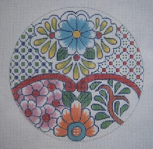
I have no restraint when it comes to Mindy's designs, so decided I could have one more - justified, of course, by the fact that I'll probably show them in a future article for Needlepoint Now - being optomistic that I'll finish all three I now have.

This will be worked the same way, as it's very busy in pattern - the clear beads on the flowers, and cotton floss on the background. Kreinik metallic braid #032 will be the outline, as it's white, and the sparkle is needed, I think.

The DMC colors are absolutely beautiful for this. The matte of the thread will also show up the beads well, and let them shine. As I had no sillks in my stash in these colors, I was able to get all new threads in cotton for it, which was my original preference anyway.
Please do go to Mindy's web page and see her other fine things. I didn't realize it until I spoke with her, but she has been around as long as I have - close to 40 years, and has her own store, as well as her wholesale to shops around the country. See her at Mindy's Needlepoint Factory.
Also, if you haven't used beads on the painted canvas yet, I have put my original book on Beads! into two chapters under e-patterns (to download and print out) on my web page. This method is so simple, and something I really enjoy doing - not at all complicated.
The book itself has also been revised to include both chapters and the variety of projects I 've done since it was first printed - and lots and lots of colored pictures. You can see it on Elegant Whimsies.

Thursday, June 18, 2009

Finding Color Schemes

While I'm having an acute case of PPD (post project depression after painting two major canvases) and resting my poor aching back, I was looking through a neglected stack of magazines. I subscribe to a number of the "better" decorating publications, which is a habit I acquired in Interior Design school, as the images are great to imprint on the mind, and it's a good source of information about color and furniture trends - fabric patterns, etc.

I found this gorgeous page in an issue of VERANDA from last November./December, and saw immediately a color scheme for a new piece of bargello I've been wanting to do. As I've mentioned before on this subject of choosing color schemes, the art directors of these magazines - and in this case, whoever designed this beautiful ad, certainly know what they're doing!

This is a "complementary" scheme, meaning that it uses the red and green, which are opposites on the color wheel. The two colors are used at rather low intensities, which when mixing paint or dyes involves just adding a bit of green to dull the red, and red to dull the green - which makes them very compatible - complementary isn't easy to work with. Even the brown, as you see it, is very very low intensity (dull) red, which means green was added to it until it's almost neutral - that's why it works so well.

What makes the scheme interesting is the different values (light and dark) of the colors. These are things you don't really need to know as you select a scheme that's already been done - I just analyzed this one to illustrate what it is.

I keep file folders of color schemes, furniture arrangements, fabric patterns - all those things, as they are a great aid for me in designing decorative accessories. Not to copy them, but as inspiration and to keep up with trends.

I'm already getting out the cotton floss to put this color scheme together to use for something - probably the bargello I have in mind. Of course it will benefit by the addition of something sparkly, and something shiny as well as the cotton.

Tuesday, June 16, 2009

More Church Work!

A friend took this photo and brought it to me - it's a Communion Server's bench that I designed for Church of the Good Sheperd here in Austin apparently five years ago, as 2004 is the date on it. (I couldn't remember)

It was a gift to the church from the senior Sunday School class that year. I used the theme of the grapes, as on the St. Andrews kneelers - and the chalice was taken from an actual one used by this church.
There is a gold Latin cross at the bottom, but it's hard to see, as this is a digital camera pic. from a glossy photograph my friend brought over. We aren't real "swift" with these electronic devices.
I thought this might give some of you an idea of something to do for your own churches. Also - I'm busy with other things, and haven't anything new to post right now. Maybe in a day or two.

Sunday, June 14, 2009

A Beautiful Quilt - both "Crazy" and "Sane"

The very first crazy quilts that really inspired me to adapt to needlepoint (since I studied the Victorian quilts in the 70's) were made by Allison Aller of "Allie's in Stitches."

I found her, and also Sharon Boggon (Pintangle) when looking for the vintage crazies, and it only took me a short while to become really addicted to this new art form. Her "Crazy for Flowers" was in progress then (an award winning quilt that year), and I was enchanted and hooked, although departures from tradition are difficult for me sometimes.

This morning I found that she has started a new quilt, and is using this one - a vintage quilt that combines both "sane" and "crazy." It clearly demonstrates, of course, the difference in the terminology, and I intend to follow it every step of the way, as she will embellish it in her own way, and I'm sure it will be enchanting, as is everything she does.

Art Crazy Quilts are fascinating to me, although I am not fond of hand sewing - or the labor of backing, etc. - all the things that go into finishing one, so for handwork I stick to knitting and needlepoint. Of course there is always the consideration that I will find something to adapt for a new needlepoint design. (Allie says she will convert me yet.)

Anyway - if you haven't already begun to follow this blog, do go take a look, as she is at the very beginning of making this quilt, and her tutorials are great - very clear and easy to understand.

As a designer, I find that I enjoy these fiber arts blogs immensely - especially the crazy quilters. There is a lot of inspiration through beautiful images that seem to imprint on the mind, and it was with these lovely quilts that I became interested in silk ribbon embroidery about 10 years ago.

Friday, June 12, 2009

A Cross with Silk Ribbon Flowers

This isn't a good picture, but a photo of a picture I took several years before I had a digital camera. I may have shown it on a long ago post, but thought since the subject has been silk ribbon flowers, I'd show it again. Anyway, it was when I first began playing with silk ribbon and exploring the possibilities for surface embellishment.

I don't like wasting time and materials, so devised a few useful shapes to teach myself. This was after learning the stitches from Judith Baker Montano's book "Art and Inspirations" - which was the first of her books I purchased.

Also, I was working on different ways to use beads, as incorporated into the body of the needlepoint, rather than just as accents. You can see them at the intersections where the "lattice work" crosses.

I have found making silk ribbon flowers to be almost instant gratification (sweet peas are the exception) - and these are just very very simple ones: spider web roses and French knots, with a few straight stitch "forget-me-nots." Also, Japanese ribbon stitch is used to make the blue buds on the trailing vine.

The flowers are, of course, added after the background is stitched. Beads are added last, but the places for them are left bare during the stitching. Click on the picture to enlarge it, and you will see these details quite clearly.

Wednesday, June 10, 2009

Diamonds and Sweet Peas for April

The diamonds are made with beads, and the flowers are silk ribbon. I made the fly stitch vine on the blue patch with Soy Luster - and am really pleased with the look of the matte thread on the shiny Smokey Blue ribbon floss. Looking at the photo I just made, I see where one more leaf needs to be added - but not tonight. This is FINISH. All done!

The Sweet Pea vine is just too busy and exuberant for the CQ design to have any more surface embellishment.
The detail is to show how nicely the different textures of the threads, along with the silk ribbon flowers and sparkly beads, blend for an interesing, but fairly simple design. The white patch (see above picture) is made with DMC pearl cotton, as I wanted it to resemble a wall for the pea vine to climb.
This piece will be on my web page after I get the instructions written up (the hard part - bummer) both as an e-pattern for people who want to draw their own, and as a package with the painted canvas ready to work.

Tuesday, June 09, 2009

The Enemy of Perfection: Silk Sweet Peas

One of my favorite quotes of all time was from the movie "Beau Brummel" when I was young and impressionable - about Beau Brummel, friend of George III of England. When being outfitted in that first tuxedo he created, he told his tailor, "Haste is the enemy of perfection."

I was looking at these silk ribbon sweet peas this morning, and thinking maybe I should have practiced a bit after I figured out how to do them - as this is one flower I haven't seen done before. However, if I had practiced and made them better, they wouldn't be "hand made" but would start looking like the machine made things.
I do love the charm of hand stitched as opposed to the regularity of machine generated embroidery.

I have to do this bit by bit, and then put it away for a few hours and look at it again to be able to tell what it needs next. I think a few more leaves, and it will be done except for whatever I decide to do on that blue patch on the left - has to be simple so as not to compete with all those dancing sweet peas.
The detail is showing the little curly thing that will attach the vine to whatever wall it's climbing on. This is just a simple back stitch made with 4plies of Splendor silk. I just kind of "drew" it with needle and thread - improvising. This is part of what is so enjoyable about surface embellishment with silk ribbon flowers!!

I've been out taking pictures of a few flowers I found in the neighborhood - Austin is already baking from heat and lack of rain, so I wanted to get what I could find so I can try to re-invent them in silk ribbon. I already figured out how to replicate the crepe myrtles, which have amazing tolerance for Texas weather.

Monday, June 08, 2009

A Mutant Pea Vine in Silk Ribbon

I have a better shot now of the placement of the needle in the center of the ribbon to make the Japanese ribbon stitch. Also, had an AHA! moment this morning when I wasn't so tired, and realized that putting a size 20 tapestry needle in the loop made it lie a lot flatter than the trolley needle, which is a size 18 or larger needle.
Also, by just using the tapestry needle, I could leave it in the loop until I was finished pulling on the ribbon. It looks so much better, that I pulled out the ugly one I made last night. You can see where the arrow is how much better it looks.


I won't point out ALL of the botanical errors on this, as maybe nobody will notice that the buds are larger than the flowers, or that the sweet pea blossoms aren't hanging in clusters. It's only needlepoint, after all, and it has limitations.

I'm hoping that they at least resemble sweet peas by power of suggestion - since diamonds are the birthstone for April, and the beads do rather glitter and sparkle. (Sundance size 14, #250 hex beads, crystal clear) It has a long way to go, but I'm trying to be patient and not force it. I'm looking at three print-outs on my table as I go that I found in Google images of sweet peas on their vines.

I'm beginning to "see" July in my head finally. It's my birth month, as well as five other people in my immediate family. I didn't want to make it the usual red, white, and blue with stars and firecrackers - as the flower is the lovely lotus, or "water lily" - one of Monet's favorites to paint. (out come the books again.) and the stone is the ruby. If I start on this, I can delay August and the gladiola a little longer. I finished everything but that sometime early last fall.

Sunday, June 07, 2009

Sweet Peas and Silk Ribbon (for April)

I had put this thing away for a while, and didn't get it ready for April, as the sweet peas kind of had me stumped. I finally got it out again, and all the images I had printed out of sweet peas on vines - and this is what I came up with. It's a long way from being finished, but so far, I'm almost pleased with it.

I decided to make the flowers before placing the leaves and little curly-cue things that pea vines have - usually I do leaves first. Anyway, I needed to be able to make the tops flat instead of pointed, which isn't an easy task with 7mm ribbon (this is from River Silks).

Japanese ribbon stitch, without pulling the ribbon all the way down, made the top look like I wanted (almost) - and loose French knots worked well for the little trumpet shape of the blossom.

To get this flower started, the 7mm ribbon needs first a plain stitch for padding, as the ribbon wants to crunch up an make a skinny petal - then make another stitch over it, but go down with the needle right in the center of the ribbon.

The picture is terribly fuzzy, but I didn't look at it until it was too late to re-photograph. I use a trolley needle and/or a cable hook (from my knitting ) to hold the loop while I make the next stitch. Otherwise, the tiniest bit of tugging on the ribbon will pull it all the way through and ruin the stitch.


I forgot to put up the picture of the seam treatments first - so here it is. The stitches are simple, as they mustn't, in this case, compete with the diamond chain or the sweet peas - it's a birthday crazy after all!! The buttonhole stitch above the white patch is made with Soy Luster - three plies. The white fly stitch is Kreinik #12 braid, color 032.

The Fern Stitch between the blue and green patches is Splendor silk, 4 plies. More on this in a day or two - Tomorrow is Monday, after all, and I need to paint a thing or two before I can declare "stitchin' time."

Saturday, June 06, 2009

Painted Canvas and Beads - the Cacti

These wonderful little cactus pieces are almost finished - but I have other things I have to do before I can spend the time. (things with deadlines). These were really enjoyable - something small and easily accomplished during morning coffee!

The canvases are by Tish, produced and distributed by Sundance Designs - well painted and delightful to stitch, and only 2 1/2" square. The prickly pear is only missing a few beads, and it'll be done.

The leaves are stitched in basketweave with Petite Very Velvet by Rainbow Gallery, and the flower petals are done with DMC Satin Floss. The centers are made with smyrna cross and Soy Luster, as the Satin floss I used for the petals was "too much" shine.

I used green #650, size 14 beads on the leaves, and my favorite #250 clear above the purple zig-zag, applied with purple floss so that they look purple, but still subtle.

The purple zig-zag was only one line of stitches, but as it was placed on the "bump" stitches (the warp threads), I decided to just make it double and put the beads on the next line - the weft dips. By using the clear beads, the effect is soft, and really nice. You can see where the dots are just below the purple floss stitches.
The barrel cactus still lacks a few stitches and some beads, but you can see the effect anyway. Again, the flowers were stitched with DMC Satin floss, and the centers were made with Soy Luster - the "shadows," yellow, as I like the very soft overdye look of this thread. The green beads make splended spines!
The last picture is showing the barrel cactus with only the top line of beads done - every other stitch, of course, as they are placed on the weft "dips."
By showing these canvases both finished (almost) and in a state of being worked, I hope to demonstrate how well just a little bit of "enhancement" serves to show a painted canvas to it's best advantage - These are too small to try to use a lot of different fibers and decorative, textured stitches, as they would lose their charm and simplicity.
On the barrel cactus, I used my "dotted swiss" stitcih on the background, as it needed a bit of "jazz," but the prickly pear needed no more than basketweave, as the P.P. leaves are decorative enough.

Wednesday, June 03, 2009

More Silk Ribbon and Color!

This heart is another piece that was totally inspired by an art crazy quilt - even the colors. At this point, I was fascinated with replicating as closely as possible in needlepoint, the fabrics used.

While the background fabrics are important, as they determine the general color scheme, they are secondary to the surface embellishment - the seam treatments and embroidery. I have seen needlepoint crazy quilt misinterpreted and used as nothing more than just patches of decorative stitches - this misses the point, and also eliminates the fun part!


On the detail, the arrow points to a section that on the original quilt was a patch cut from a silk tie. I got "the look" by using Hungarian Criss Cross, and inserting beads in the spaces where usually just another stitch is made - very effective in these two colors!.

The close-up also shows the simple silk ribbon flowers. The white ones were made with simple "ribbon stitch" in 7mm ribbon, and the buds are just very loose French Knots worked with the same. I made the details in the flowers with two plies of Soy Luster - tiny French knots at the ends of the yellow stamens and in the centers.

The swag of roses was done with two shades of 4mm green ribbon - making the light leaves first, and then going back over them with the dark. The roses are French knots worked with Thread Gatherer 4mm overdyed ribbon. At this point, it's kind of like painting with your needle, and is really fun - instant gratification here. You can also see the other seam treatments, which are just simple embroidery stitches - like fly stitch, chevron, and buttonhole..

The next detail shows the patch with beads - worked in offset Mosaic stitch with beads placed in the blank spots left. The arrows point in the direction of the stitches - the way the thread slants, which is also the way the beads are placed. I have seen some confusion on this point - where people attempt to place the beads end to end instead of putting them on simply as another tent stitch. As even the round ones have a tendency to look like bugle beads when placed this way, they appear awkward and crowded.
The tiger skin mini-sock is a bit off the subject, but it demonstrates clearly how the beads should lie. I turned the canvas on this one so as to have the heel and toe going in different directions - it looks like sparkly diagonal stripes this way.

The pattern and instructions for the CQ heart are on my web page as an e-pattern, as people have been asking for the patterns for them. It's a really fun way to experiment with embroidery techniques and silk ribbon! I have also put my bead book there, divided into two chapters. I just finished putting an ornament on the Freebies, etc. site - with a swatch of "lace" as a seam treatment. Go take a look!