 I've been thinking for the past few months about doing extensive tutorials on selecting canvases to stitch, (and then how to begin stitching) as I've seen so many beginners who wanted badly to learn needlepoint, but then purchased a really poorly drawn and painted one that wasn't appropriate for a beginner anyway. This is very discouraging, and many lose out on what could have been a wonderful and relaxing hobby.
When I was teaching many years ago, I painted my own beginner pieces that served well for children and adults alike - as they consisted of a few nice, clear flat areas of pleasing and colorful design, were small enough to not be overwhelming, and carefully drawn for ease in seeing where to put the next stitch.
Also included would be elements needed for teaching techniques, such as outlining, veins in leaves or butterfly antennae going in opposite directions on the canvas, and irregular curved shapes. Sadly, the canvases on the market now lack this sort of thing, and pieces labeled "beginner" are pretty bad in many cases.
I actually saw one that was a dragonfly - beautiful picture, but entirely too many lines on it, hardly any flat spaces, and on close inspection, the lines were so badly drawn that some of them were down in the grooves between the threads. The background was beautifully shaded, but very very difficult for a beginner - or even some experienced stitchers!
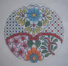
The first illustration is a little canvas I stitched that was designed and painted by a young friend of mine who had great potential as a designer - and did have some lovely "beginner" pieces in her line. I redrew it, as the original needed some help - I was tutoring her on drawing and painting. The second picture is the same flower, but stitched by the artist herself before she learned that the outside of the circle should have been outlined first to contain the decorative stitches and avoid the jagged/raggedy edges. More on that later.
The background on the first one was stiched AFTER the leaves were first outlined so that it would meet the pattern neatly without making a mess.
I think the poorly painted canvases are a lot responsible for designs being smothered with "goop," as people don't quite know what to do with this problem, or where to start and stop, so just start adding layers and layers of threads and too many decorative stitches, which creates an eye shattering mess..
 Next is another of the beginner flowers in the series - a charming canvas. Below it is the designer's stitched piece, so you can see the difference just a symmetric drawing makes, as on the first version.
 The arrows are pointing to places that are jagged due to it's needing to be outlined first. Messy and unattractive!! More on this in another day or two - and then we'll begin learning to stitch!

Actually, I like her thread colors better than mine on this design. I'm hoping this lady will decide to resume marketing canvases again, as she does have talent and a lot to offer!
Last on this entry is the egg - it's a bright and pretty design, but the outline of the egg is not only drawn with a harsh, black line that will most likely show through the thread, but it is totally lopsided and asymmetric.

It takes very little effort to stitch count a symmetric egg onto canvas, and it it finishes so beautifully, it's worth the effort. I think this is also a problem with the shop owners, in that they see a pretty design when buying, but don't really look closely to see how well or poorly the drawing and painting is done - so learn to really LOOK at a canvas before you purchase it.This you will understand after you begin stitching!


2 comments:
I think this is something that cannot be said too often. Those of us who are experienced don't even notice the tweaks we perform on a design as we go along, but beginners are easily intimidated or knocked off course. And even the best of designers was a beginner once. . .
Great tutorial. I hope any of your readers who are working with beginners will point them this way!
Post a Comment