skip to main |
skip to sidebar

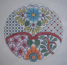
 An idea - this is how it begins: An image! (Needlepoint is slow to stitch, so I won't get this done, obviously, by tomorrow - but I can get the canvas painted.) When I first saw the colors for April, my immediate thought, was the Australian Aborigene art and the old Amerindian pottery - mainly the Pueblo pottery of New Mexico. I first saw this beautiful ceramic when I was about 7 years old, and visiting Santa Fe with my parents. At that time, of course, it was the color and form I liked, with no thought to how it was made or where the colors came from for the decoration - or the meaning of the decorative motfs. It wasn't until I enrolled in a pottery class at the local art museum several years ago (something I have always wanted to do, but had no time for in college) that I realized what a wonder these things are - they are totally coil built! Amazing how uniform the shapes are, and how smooth the surfaces. The study of the flora and fauna and other shapes and their symbolism is an area I want to get into, and have now ordered some books - so interests change! (Last year it was the exuberant and flamboyant Mexican Talavera-style ceramics) The illustration is an Acoma pot from the mid 19th century - from the collection of the Art Institute of Chicago. I browse there often just to look at these wonderful works of art. The Mimbres pottery too is a great source for design, as it is more conventionalized in pattern - so quite mathematical, which is what I enjoy. The next step in this process, happily, was to go to the LNS for threads and beads to use in the stitching. (I always love a valid excuse for spending money on these things).
 I had a bit of trouble with the golden/orange, so had to opt for the Splendor silk with some beads a bit more subdued, which will, I think, get the mottled effect of the color on the pot. The Sundance beads, fortunately, have many colors in the finish that isn't glittering or sparkling -so will just add some textural interest to the piece. The simplicity of this work would not be suitable for doing textured "fancy" stitches, but it does need something to jazz up the needlework a bit. I have already made a rough sketch of the motifs on the pot, and now just have to rearrange and clean it up a bit - and with artistic license, create a wonderful decorative accessory for my home! Tomorrow, which is the last day of April, I will show the painted canvas!
 Almost 40 years ago, when I first began interpreting Oriental porcelains into needlepoint design (primarily the Chinese and Japanese of the mid 19th century export type) I became intrigued by the fact that there were so many repetitions of flowers, bugs, leaves, and other symbols in these beautiful pieces - so set out on another course of study into the meanings of these things. This morning, digging in a box of old canvases, I found this one - one of my very favorites, as was the oval shaped, footed compote that inspired the design. (dated ca. 1820) The first study I did years ago revealed that Celadon was the oldest known porcelain glaze, and that it originated in Korea - and went to China via a kidnapped Korean. Recently I have read otherwise - that it actually developed in China. I don't know. Anyway - this slightly bluish green is my favorite color! The design features the grasshopper (good luck) and the peony, which is the symbol for spring and also for wealth and nobility. The camelias, for winter, are also shown - and the "veins" on the background are the veins of the lotus leaf (water lily). The lotus is the symbol of summer. The border is the conventionalized "ocean waves" which is a pattern used by both Chinese and Japanese.
 Also in this box, I found a crumpled canvas that is almost finished in the stitching, and destined for my son, who gave me this lovely bowl about 14 years ago. (dated ca. 1850) The butterfly is the symbol of joy and fidelity, and also shows a "coin" which is for prosperity. Butterflies are rather prevalent in Chinese art - embroidery as well as porcelains. The inside of the bowl displays a typical symbol in Chinese art - the peach for immortality, and the pomegranite for fertility. I thought the whole thing would be quite a suitable choice for this son, as he had just taken the giant step and started his own law firm. I really must get busy and
  finish the canvas for
  him. He has probably forgotten about it - but it did take me 8 years to finish his dodo bird pillow. Oh well. He is used to his mama's strange ways. I might also give him the bowl to display with the stitched canvas, which will probably be framed.
 This was an experiment with my simple "laces and trims" to see if I could build a little mini stocking with just a few elements in the way of threads and beads. Starting with my basic mini-stocking outline, the red flowers were stitched with Kreinik metallic ribbon (the petals are Caron Rachelette - a tubular nylon with a glittering cord through it) Then to make the heel and toe - nothing more than ric-rac with Kreinik metallic ribbon. It lies so nice and flat! It's amazing how the same fiber can look so different according to the stitches used and the way the light hits them. I used ONLY the YLI ribbon floss in white for the body and cuff, and the heel and toe are the same, except in the shimmer blend. The stitch for heel and toe is Nobuko, at the suggestion of my friend Pat (see her beautiful stumpwork project in progress here.) I was wrestling with both color and stitch, and not happy with my choices. Sometimes it takes a practiced eye - and one that isn't tired of looking at the project to come up with just the right thing. I turned the canvas so that the direction of the slanted stitches lies in the right way for interest. The stripes in the body are nothing more than Kreinik metallic braid with a bead inserted in the little "jewel" space. As for the name - I had to figure out something, and decided on the name of my baby son's current lady friend - but with hesitation, and then realized that it is also the name of one of my favorite dear, departed cats - we have a lot of those on the Christmas tree. A fitting memorial. Now on to something more colorful. (If the human Angie is here for Christmas, we won't tell her about the cat.)

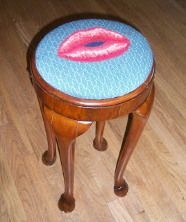 There is only one person on this planet for whom I will do custom needlepoint design - and my friend Marilyn is it! Why are all my friends equipped with a bizarre sense of humor? I fought this one for two years, as I thought the gorgeous stool, an antique she purchased in England, merited something with more dignity.( I dont know why I bother to argue, as she always wins.) She brought it over to show me a little while ago, and I laughed out loud when I saw it. I don't know if the picture is clear enough to see, but the cabriole legs end in hooves! Who else but Marilyn would want this cover for it. Do notice the beauty spot by the lips- and the lovely diaper pattern background. We taught her housekeeper, Veronica, (in Spanish) to stitch background, and so on to the next project. I'm wondering "what's next?"


"
Haste is the enemy of perfection" said Beau Brummel (in the old movie starring Stewart Granger). I was really impatient to see what these things would look like - so wrapped them around a skinny rolling pin, and taped them on - wanting to see what the spirals would look like, and if they worked. They do!! The spiral trims actually meet at the right place on the other side at the seam - making a continuous line around the cylindrical shape. The red one isn't even nearly half finished, but is exciting, nevertheless. (the horizontal version of the lace and trims) I need to stitch the red around the flowers next - and then the flowers themselves, which will be worked in "bump" stitches in Kreinik metallic ribbon - a really nice, sparkling, shiny white with green leaves and yellow centers. These little "laces and trims" and "jeweled chains and bracelets" have many possibilities for design - I'm now seeing heart shaped ornaments done with the same elements, but different colors.
 It's amazing the different effects one can produce with the same thread, but different stitches. This red piece is another "rollie" which will be finished as a cylindrical shape to hang on the tree or maybe as part of a mobile at Holiday time. This time I used the laces and "bracelet" trims in a horizontal layout, so needed the vertical lines to anchor it. The red ribbon floss is identical, except for using the shimmer blend for the basketweave around the beaded bracelet - but due to the way the light plays on the long, flat stitches above and below, it looks much darker. I wanted the vertical lines to be rather subtle, so used my favorite crystal clear Sundance (color 250 hexagonal) beads with red thread - so that they will glitter as the ornament turns, but not be a different color. There are single gold tent stitches between each bead. Also - I chose to use
  beads on the bracelet, as the Leviathan stitch I normally use for this count was too lumpy and prominent for the effect I wanted. You can see on the detail the tent stitches on the warp threads, getting ready to insert beads on the weft - very simple for a small area, and it looks solid beads. I ran out of gold braid (Kreinik gold #221), so am waiting for more to arrive so that I can outline and stitch the flowers - and continue on down to the bottom. Meanwhile, in addition to the spiraling rollie, I have the little mini-stocking to work on. Again, I used the YLI ribbon floss, and stitched long, flat areas going in different directions. The way the light hits them adds to the surface interest. Just for fun - I used multi-colors for the beads. Red, gold, green, and blue - a kind of "confetti" effect. I had to just use white floss to apply them, as I wasn't about to use
  colored thread and have to re-thread the beading needle so many times. The ric-rac on the heel is made with the Kreinik 1/16" ribbon in green #015, which is one of my very favorites!
 It lies so nice and flat, whereas the braid would be a bit difficult. I'm not really sure what I will do with the heel and toe - will decide after I get the rest of it done. As for the name? Who knows? Maybe a family cat. Incidentally, if you click on the detail of the red rollie - the one with the warp threads stitched - and enlarge it, you can easily see that the weft stitches are left bare for the insertion of the beads. I wasn't able to do that when drawing the "chains" on the mini-stocking, as I left an even number of threads between them so that I could make the long stitches in opposite directions, and needed a center. The beads wobble a bit, and it is very annoying - but couldn't be helped.
 Changes in style - or maybe "go for the gold." It's unbelievable the changes in needlepoint design and stitching due, I think, to the enormous number of new fibers and materials available to us now, that we didn't have even 20 years ago. After almost 40 years of designing painted canvases, mostly "interpretations" of antique Oriental porcelains, I have lost interest due to having a whole new passion for trying out every new fiber or thread or bead I can find - and using them in different ways to see what effects can be achieved. I was doing "lace" and "trims" in the 70's - but with the look of cotton lace, as all we had at that time was Persian wool or tapestry wool or cotton floss. There was nothing shiny or sparkly - so the emphasis in needlepoint design was in color and pattern rather than surface texture and embellishment. Times certainly have changed. I refused to do Christmas ornaments back then, as I thought they were rather ugly with no sparkle. Now I can't stitch them fast enough, as I use them for practice and "research" (good excuse for indulging my addiction) - investigating the characteristics of each new thread I see - and I can't resist buying something new if it is a pretty color and/or it sparkles. As I was doing this piece - which will be a "rollie"
  (will finish as a cylindrical shape, with the laces and trims spiraling around it) I realized that the metallics I'm using for the whole project are incredible in their variety - especially among the golds.
 In the three pieces I have drawn, I have used three different metallic golds (from Kreinik), and each of them has several "faces." For instance, the braid used on the spiraling ornament is 002V - "vintage" - and is a soft, gleaming matte. The plain 002 (which I'm using on another mini-stocking) is beautifully sparkling, and the 002 High Lustre is glittering! Then there is also the 002 in the same finishes, but in flat ribbon - 1/16" and 1/8"for use for different effects on different size canvas. On this piece, you can see that the green leaves are stitched with 1/16" metallic ribbon so that they lie nice and flat - an effect I couldn't acheive with the braid in the same color. The veins are a slightly different color - but are braid, as the ribbon is too wide for this. WOW. Having choices is wonderful! Twenty years ago, the only metallic available was a blending filament, which could be used to add a tiny bit of sparkle to cotton floss. The only other option was a horrid, raveling, brassy looking gold, which didn't do much for design work.
 The rollie with the horizontal bands of laces and trims could easily be turned sideways and become an evening bag - and the experiments and ideas just keep on going round in my head. The detail shows yet another of the golds I am so fond of. This one is a pretty "Florentine" looking braid - the 221,
 which also is available in the other types. I will be putting a red background on this one, so like this particular gold for it. (more on this another time as these pieces develop.) The spriraling piece - which I think is rather clever, as it took me an entire afternoon of cutting up TP tubes after drawing lines on a 45 degree angle around them to figure it out - has a lovely matte velvet background - the Rainbow Gallery Very Velvet - which is why I chose to use the Vintage gold braid. It's gorgeous - the two together. Change is good, I think.!! At least this kind - where it adds to the enjoyment and versatility of a great hobby and occupation.
 It's strange and wonderful how a "happy accident" can change one's methods and techniques. When I was working on the PLAID book, and thought I had done everything I could do with beads, I was bored one day, and decided to work the weft bands of the plaid in beads of the same colors as the threads I was using. (see an earlier post on beads with needlepoint). To my amazement, the thing looked beaded solid - but actually much nicer, as the beads were placed only on the weft, so nestled down into the little dip - and the look wasn't cluttered and crowded as it had been when I had attempted using them on small spaces on Christmas projects, etc. Amazing!! The orange flower on green - the very gaudy piece - is "solid" (but isn't really), as is the pink fret and the little teal border. The backgrounds have the beads spaced a bit for added interest. I use this technique when basketweave would be boring, but textured stitches too much. It's actually very very easy and takes much less time than one would think (or I wouldn't do it, myself - I'm a bit lazy.)
  The little flower is another experiment with this "all over" method - but on the background I used only the Sundance #250 beads, which are crystal clear. By using cotton floss to apply them in the same colors as the patches, they have a kind of muted, frosty look - the colored thread shows through the beads. The flower was done all in white, green and yellow beads to make it stand out more from the background. As I have said many times, just playing around with this fun stuff and trying new things can lead to all kinds of great discoveries that add to and enhance our enjoyment of stitching needlepoint - or anything else.
 One thing leads to another, it seems, and there is seemingly no end to the possibilities for design and enhancement of needlepoint with the array of fibers, metallics, and sparkling beads we have available now - almost non-existant 25 years ago. My own little Journey of Discovery into this realm only began about 12 years ago when I started designing painted canvas again, after a sabbatical of almost ten years of doing knitting design and painted accessories. One of the first things I had to try, of course, (like a crow who loves shiny things) was BEADS!. I bought lots and lots of beads - and then had to figure out what to do with them.
  Finally, after several years of playing around and experimenting, I had enough stitched things and techniques worked out to put them into a book, which became part of my series of WorkBook/The Coloring Book. A few months ago, I decided to resurrect this thing and put it onto my new web page, but looked at it, and saw Old, Obsolete, and Boring - as I have, in the last two years, been so inspired and motivated by the images of the art crazy quilters I found through the Wonderful World of blogging. (Allison Aller primarily) I started over, learned new computer skills fast (but with dummy type difficulty), and here it is! Finished!! and hopefully more interesting and informative than the first one. I have attempted to create/replicate "fabrics" in needlepoint, and have used beads for decorative effects where I didn't want embroidery - great effect! This reminded me of a project that almost became a UFO and relagated to the bottom of the box - but now I think I will dig it out and begin the embellishments - after a few more beads, of course.
 You can see clearly on these close-ups the great effect of working beads into the background, creating a very decorative "fabric." Now I need to get back to the embellishing - but already have another design project on the table, with beads and fibers and metallic braids and ribbons selected. What a JOY!!
 Gail and I have continued to chat most of the day (creative avoidance, as we each have plenty of work we should be doing) about the enormous changes in design in our world in the 36 years we have each been designing painted needlepoint canvas. I dug these pictures out of an ancient file that I really hated to part with - really unusual and classic style that I used to love doing. Although I don't think I have the patience any more to produce work of this sort - it's nice to remember that I used to! (Gail still does - but she is a young chick - not yet 60!) The icon is the Russian St. Innocent, Patron Saint of Alaska - requested years ago by a woman in Sitka, where most of the population, she said, is of Russian descent. The toad and leaves were the first custom canvas I painted when I moved back to Austin - a chair seat for a woman who loved the old style and recognized and valued the benefit of a
  canvas painted well with good shading, but easy to stitch in traditional basketweave! The colors, coincidentally, are in keeping with the April TIF Challenge.
 On the subject of change: I was looking back through a file last night looking for something, and was amazed just at the changes of interest, style, inspiration, and subject matter in the needlepoint crosses I started painting 12 years ago. Then, my friend whose work I admire so (and sometimes envy and most of the time covet - she makes me guilty of these two of the "deadly sins" I'm afraid, as I have been surpassed), posted on her blog two absolutely gorgeous pieces she designed many years ago. The change in interest - and many
  times the quality of the canvas itself - is amazing. There is so little these days of the really classic, traditional, and elegant - at least that I can find - the things that one may do simply in basketweave with great pattern and color - relaxation! Take a look at these here on Gail's blog, along with other beauties she has created. I also painted a lot of the early Christian art back in the 70's and early 80's, but focused on the Book of Kells of the Celtic Christians, and the icons of the Russians, Byzantine, and Catalonians. Hmmmm. I'd rather just buy Gail's than resurrect mine.
 The colors for the Challenge this month startled me a bit, as where I live the flowers of early spring are in full bloom, and the trees are leafed out. I had forgotten that Australia is heading into fall and winter. Anyway - my immediate thought was the wonderful Aborigine paintings I love - especially in the traditional colors of the ancients.
 I don't like change - would rather, sometimes, just roll around in the rut of the "familiar," but unfortunately time passes and changes happen. Thinking about this (thought provoking), I realize that there seem to be bridges that we use to get from one change in stages of life to the next - and I am just now seeing what these bridges have led to when I have used them well. My introduction to the Australian Aborigine art occurred when my oldest son decided to start his own law firm, and his receptionist is a collector - goes to Australia to shop, and has shown all of us the beauty and value of this art. My child's growing up, getting his law degree, and becoming an independent adult was, indeed, a major change for me - but a positive one, even though it hurt a bit. (I'm used to it now - been through it five more times. I have gotten over shedding a tear at the supermarket when going down the cereal aisle).
  The next traumatic change for me was the "empty nest" - at which point two of my sons decided I needed a computer to keep Granny busy and out of the dance halls and off the streets (their terminology). I never wanted one, refused to have anything to do with one - but now three years later, needless to say I'm hooked. Addicted. This is my research library, my recreation (jigsaw puzzles), my social life (blogs) and a source of inspiration for creativity. (Sharon B's TIF Challenge) So- the computer is another bridge to get to the next phase of getting older and slowing down a bit - in body but not mind. The illustrations are from my two favorite galleries in Australia - if not acquainted with them, do take a look and explore.
 I won't use these images for design work, as they are the property of the artists and the galleries who show them. Mbantua is the one my son-in-law (also a collector now) buys from. The other, http://www.jungara-aboriginal-art.com.au/ is one I discovered a while back on the internet - and I spend a lot of time browsing and admiring these lovely works. I don't accept change gracefully, but rather go kicking and screaming if dragged there by my children-who-are-not-chldren any more, but who probably have my best interests at heart. I think with this topic of "change" I will look more closely at the bridges I could find that would get me to the next phase with grace and gratitude and a more positive outlook.

 An idea - this is how it begins: An image! (Needlepoint is slow to stitch, so I won't get this done, obviously, by tomorrow - but I can get the canvas painted.) When I first saw the colors for April, my immediate thought, was the Australian Aborigene art and the old Amerindian pottery - mainly the Pueblo pottery of New Mexico. I first saw this beautiful ceramic when I was about 7 years old, and visiting Santa Fe with my parents. At that time, of course, it was the color and form I liked, with no thought to how it was made or where the colors came from for the decoration - or the meaning of the decorative motfs. It wasn't until I enrolled in a pottery class at the local art museum several years ago (something I have always wanted to do, but had no time for in college) that I realized what a wonder these things are - they are totally coil built! Amazing how uniform the shapes are, and how smooth the surfaces. The study of the flora and fauna and other shapes and their symbolism is an area I want to get into, and have now ordered some books - so interests change! (Last year it was the exuberant and flamboyant Mexican Talavera-style ceramics) The illustration is an Acoma pot from the mid 19th century - from the collection of the Art Institute of Chicago. I browse there often just to look at these wonderful works of art. The Mimbres pottery too is a great source for design, as it is more conventionalized in pattern - so quite mathematical, which is what I enjoy. The next step in this process, happily, was to go to the LNS for threads and beads to use in the stitching. (I always love a valid excuse for spending money on these things).
 I had a bit of trouble with the golden/orange, so had to opt for the Splendor silk with some beads a bit more subdued, which will, I think, get the mottled effect of the color on the pot. The Sundance beads, fortunately, have many colors in the finish that isn't glittering or sparkling -so will just add some textural interest to the piece. The simplicity of this work would not be suitable for doing textured "fancy" stitches, but it does need something to jazz up the needlework a bit. I have already made a rough sketch of the motifs on the pot, and now just have to rearrange and clean it up a bit - and with artistic license, create a wonderful decorative accessory for my home! Tomorrow, which is the last day of April, I will show the painted canvas!