 While I'm having an acute case of PPD (post project depression after painting two major canvases) and resting my poor aching back, I was looking through a neglected stack of magazines. I subscribe to a number of the "better" decorating publications, which is a habit I acquired in Interior Design school, as the images are great to imprint on the mind, and it's a good source of information about color and furniture trends - fabric patterns, etc.
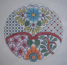
I found this gorgeous page in an issue of VERANDA from last November./December, and saw immediately a color scheme for a new piece of bargello I've been wanting to do. As I've mentioned before on this subject of choosing color schemes, the art directors of these magazines - and in this case, whoever designed this beautiful ad, certainly know what they're doing!
This is a "complementary" scheme, meaning that it uses the red and green, which are opposites on the color wheel. The two colors are used at rather low intensities, which when mixing paint or dyes involves just adding a bit of green to dull the red, and red to dull the green - which makes them very compatible - complementary isn't easy to work with. Even the brown, as you see it, is very very low intensity (dull) red, which means green was added to it until it's almost neutral - that's why it works so well.
What makes the scheme interesting is the different values (light and dark) of the colors. These are things you don't really need to know as you select a scheme that's already been done - I just analyzed this one to illustrate what it is.
I keep file folders of color schemes, furniture arrangements, fabric patterns - all those things, as they are a great aid for me in designing decorative accessories. Not to copy them, but as inspiration and to keep up with trends.
I'm already getting out the cotton floss to put this color scheme together to use for something - probably the bargello I have in mind. Of course it will benefit by the addition of something sparkly, and something shiny as well as the cotton.
1 comment:
Whatever you are going to do with these luscious colors will be amazing....looking forward to it, and especially since it is Bargello! Oh, and would you mind adding beads to it??? LOL
You go girl!!
Post a Comment