 Enough of the pirates and back to the beads. Working again on Mindy's Art Nouveau canvas - a change of color, which is refreshing after stitching on the brightly colored one.
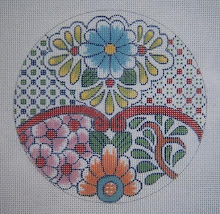
 I took some "before" pictures before continuing with this one. The first photo just shows what it looks like without the beads, and not much stitching on the floral motif, which is the focal point of this design.
The cotton floss is really pretty on this - soft and with just enough sheen. The next picture is a close-up of the little "tiles" that are inserted among the larger, plain ones. I thought they needed a bit of zing to make them show up well, but not overpower or distract from the rest of the canvas. I used the green beads that are also in the border, but the "red" ones are the clear Sundance #250's that I've used throughout the rest of the canvas. They are applied with the same red floss I used on the flower center. Again, I didn't want distracting sparkle from the beads, but a bit of subtle interest. to liven it up.

The white bumps are smyrna crosses made with DMC perle cotton #5.
The last picture is showing the fun part - definite progress. The interesting thing here is that the very very slight difference in the two greens still shows up well, using the same clear beads.
The stem of the flower is a darker green than the leaf - which is lighter and with more yellow in it. I was almost afraid the difference wouldn't show up well, but it does. If you click to enlarge, you can see the difference in the two greens below the beaded area, where I've only put in the basketweave (skipped).

I do like the effect of using the "ropy" perle cotton in white to emphasize the outlining. The very dark green is the same one as the one line border, and it will have no beads as it is background here.
Incidentally, I've had a lot of questions lately about textured stitches to use for backgrounds. Background is just that - ground that stays in the back, or should, to let the main focal part of the design show up well. I won't use beads on these areas of dark green on this canvas, as I want them them to recede and stay behind the flower.
Using textured stitches on backgrounds is usually not a great idea, unless it's something neutral and small like T-stitch, as it gets really messy looking as it gets next to patterned areas, and also distracts from the design itself. I especially dislike seeing diagonal stitches as a background, as it just draws the eye to all that directional stitching and away from the central motif.
So much for that this evening - now to go work on the first one, which is the beautiful thing with jewel tone colors. Again, it is so refreshing to have these three canvases by the same designer to work on, as they are very similar, but yet so different in color, etc.
3 comments:
I enjoyed the pirate designs a lot (I must have the soul of a 9 year old boy) but Mindy's designs are classics. I am enjoying watching her designs grow a lot. Thanks!
Excellent choices on this! These are for me??? You shouldn't have! LOL
Hi Judy,
Anne does a great job with her designs and I have several in my stash. Love the ghost singers that she was just working on. :-)
This is a very pretty canvas and I like how you are bringing it to life!
Cynthia
Windy
Post a Comment