Friday, July 31, 2009

Another Prayer Kneeler Idea!

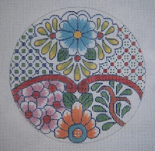
I've been going through my old old files on Cross designs, and found this one I had forgotten about. It was painted for a customer for the Episcopal Book of Common Prayer, and the design was adapted from a Faberge' egg. (I was in my Faberge' phase at that time)

As I remember, the egg was a miniature, and was the cloisonne' enamel that I enjoy designing from. This one is on 18 mesh canvas, but if put onto 13 mesh, as it is stitch counted for symmetry, it would be a lovely center for a personal prayer kneeler.
You never know where you will find inspiration for designs! This was from one of my favorite books on the subject - "Faberge and the Russian Master Goldsmiths."

I also made Christmas stocking cuffs adapted from an Art Nouveau tea service in the same book. The tulips were red, so I also got a fine ornament or two from the same pieces. I think the one that's a ball is shown in a previous post quite some time ago, and under the label "ornaments."

Sunday, July 26, 2009

More Pretty Things: Beads with Mindy (Working Again)

Working on the Mindy canvases again, this time the "#3" as I call it. After a lot of relaxing and mindless outlining in preparation for adding color, I decided it was time to do beads on the flowers, and started with the purple one.

It had to be outlined first, of course, and then the skipped basketweave worked in the three lighter shades. As always, the basketweave stitches were placed on the warp threads (the bumps), leaving the dips of the weft threads for the beads to nestle down and not wobble on top of the work.

Again, I'm using totally DMC cotton floss for this, so stitched the background of the flower with the same floss I used to attach the beads. It's absolutely amazing how well the clear beads work on a project of this sort. You can see the shading, due to using the colored floss of each area. As I worked, my mind was racing ahead to how well this effect would look on an evening bag - or even a tree ornament in brighter colors on a different shape!


I went ahead and worked a little bit of the pink diaper pattern at the top of the flower, as I wanted to see what it would look like filled in. This is what keeps a project of this sort from ever being boring. Always a new area to explore and develop.

Now I'm wanting to move back to something a bit simpler, and being tired of the beads for right now, I'm looking at the lower left corner with the delightful shaded greens. I'm thinking it might be nice in plain upright stitches. This is another great thing about working with the floss - it's so versatile that I have these options, and can stay in the same family of surface texture. This is important in a painted canvas this "busy" already in pattern and color.


After working on the green area for a little while, I think it's time go get back to "Mindy II," which is the soft colored Art Nouveau canvas - delightful and relaxing with pleasant colors and plenty of simple basketweave. A change is always nice!

Thursday, July 23, 2009

Very Pretty Things!

This is one of my favorite stops every morning while indulging in coffee and blogs and other forms of delightful "creative avoidance." I wanted to share this one, as it's pure and total eye candy and a delight to behold if you like this sort of thing - I do, although I had to LOL this morning, as she refers to things from my high school and college days as "Vintage."


Do go take a look at the Pretty Things. The photography itself is as gorgeous as the things she photographs.

Monday, July 20, 2009

Back to the Beads (and Mindy)

I'm back working on the three canvases by Mindy, and enjoying every minute of it, as the colors and patterns are beautiful, and they are perfectly stitch painted - never boring.

I have only just now started working on this one, and was in the mood for something pleasant but mindless - so began by putting in the white fretwork (in Kreinik #12 braid, 032) This geometric white line effect is all over the canvas, and is a unifying element in the busy design with so many colors.

Speaking of colors, the entire canvas will be done in DMC cotton floss except for the Kreinik braid. (Also will use clear Sundance beads on the flower design.) When I chose the thread colors, I decided to use just a very slightly lower intensity than the canvas is painted. The bright pastels are lovely, but I like them a bit more subdued - not much, but a little.

This canvas is, as are the other two, a process of being able to work on separate areas as I tire of one and move on to another. This is why they never lose my interest! Wanting to see what the next area will look like stitched is what keeps me going and entertained.

The next picture is showing part of the metallic gold fret on the upper left side. I have already started filling in the purple as it travels over from the solid area. This is intriguing, as I want to see what the shaded colors look like beneath all that fretwork!

You can also see the beads and how fine they look - the clear beads applied with the background color makes them blend well. Incidentally, this canvas is worked mainly with silk, as that's what I had in my stash to begin with - some of my very favorite colors. The other two will be done in DMC cotton floss.


Next is a shot of the leaves with the gold begun. This too is a kind of mindless exercise, and then exciting to see what they look like with the threads filling in.
This is barely begun in the lower section.

The black fret is also interesting, but I have to fill that in during broad daylight - maybe even outside if I'm up to hauling my magnifier outside. Working on black on 18 mesh canvas is no longer the easy thing it used to be. Hmmmm. Anyway - more in a day or two.

I posted pictures of all three of these canvases previously, so anyone who missed it can just click on "Beads" on the side bar labels and find those.

Sunday, July 19, 2009

DMC Floss 100%! (the Purple Ornament Finished)

I didn't like the way the Frosty Rays and Flair were looking on the flowers, as they were not the right texture to stand out against the background, so I eliminated that.

What DID work was the DMC Satin Floss (4ply), as it really shines, and stands out beautifully against the matte finish of the cotton floss.

Also, against the texture of the background being done in T-stitch.

Actually, the leaves are made with Perle Cotton, but could as well be done with floss. I like the subtle shine of this because of the "ropy" twist of the thread. It does make a bit of difference.

The larger flowers on the "lace trim" across the center were made with the same white Satin Floss, but in long, slanted stitches (4-ply), and slanted in different directions to give a bit of dimension to the petals of each flower. You can see this detail if you click to enlarge the picture.

For anyone who missed my little method of stitching with floss, I have used this for about 30 years, and found it extremely helpful in preventing the little individual plies from going astray during stitching. ESPECIALLY with the Satin Floss, which is rayon, and quite slippery. (but well worth the effort) Just take the labels off the skein, open it totally out (first removing all cats from the room) and then put the two ends together. Fold the long thread over three times and cut the looped ends. This produces a long thread, about 38" long or so, but cotton and rayon are both sturdy, and I haven't found it difficult as it doesn't fray. (This long thread doubled after you take off the plies you need, will be a working thread of about 19". It seems long, but is quite easily managed.)

Then take off two plies (for 18 mesh canvas, 3 plies for 13 mesh), double it, and thread the loop through the eye of the needle. Then put the ends of the thread through the loop, and pull a slip knot up next to the eye.


This holds the plies securely, and once the stitching has begun, they will lie flat and not separate. If you make a mistake and have to undo a stitch - then you will have to cut off the slip knot. Oh well. It happens, but not often.

This ornament is extremely simple in design, but I thoroughly enjoyed working it, and didn't get bored - probably because of the four different color areas. It was fascinating to stitch just a little bit further and see how the color looked around the next band of flowers - which is one of the reasons I enjoy just drawing a design on white canvas and not painting it.

Thursday, July 16, 2009

The Purple Ornament Progresses!

This ornament has been very entertaining to stitch, as by doing it on bare white canvas, I can see color marching along like a child with a coloring book - my preference when working on my own designs.

Anyway, it's coming to life and taking shape. The arrow is pointing to where I filled in the gap between the leaves with T-stitch, which is a simple matter, but does require a bit of thought and attention. I don't usually like textured stitches on backgrounds, as they do get a little messy around design, but in this case, the stitch is so small scaled, it didn't interfere visually.

The second picture is a detail, showing (where the arrows point) the fact that the outlining of the flowers is accomplished by stitching across the tops, and then separately, across the bottoms - much easier and more efficient.

More flowers are outlined in the third image, and the arrows are showing the direction of the tent stitch outline. This is one place I "break the rule" and turn the canvas so as to make the tent stitches stay smoothly oriented instead of letting them "sawtooth" (which is typically the look of needlepoint). It simply makes a smoother, neater edge for finishing, and keeps the textured background stitches confined and not ragged looking. This is simply a matter of switching direction about halfway across the straight edges at the top, bottom, and sides. Very simple.

The arrow pointing to the bottom of the flower on the left shows the progression of stitching across the bottoms of the flowers for the outlines.


With the fourth color begun and more color on the flowers with the centers and leaves, it's really looking fine!!

This is what makes me keep going rather than abandoning the whole project! Now for filling in the flowers, where I'll use Petite Frosty Rays and Flair - the rest is in DMC cotton for the matte look I wanted, and the Satin Floss for the centers for some shine. More tomorrow (maybe, if I don't get sidetracked) There is still the red one with the PVV and beads! Also, I hear the Mindy With Beads project calling.


Saturday, July 11, 2009

Ornament Progress: Before and After Beads!

It's rather incredible how different these two ornaments are when stitched with different threads and in different colors. Starting with exactly the same drawing on canvas!

The red one is coming to life with the addition of the beads, which glitter and sparkle in person. A close-up of this (click on it to enlarge) shows the basketweave on the flower petals done on every other row to accomodate the beads.

I could have used red beads, but am very fond of the way the clear, hexagonal ones look, as it 's more like ice crystals on the velvet of the background. The flower centers are DMC Satin Floss.

I drew another one for stitching with the pink and purple threads, as I don't like working on my own painted canvas - it's easier to see this way. The background stitch is T-Stitch, which has a nice but not overwhelming texture, and it's done with DMC cotton floss. I ordinarily use 4 plies, but in this case, I used 5, as it's on a white background, and the canvas is prone to show through with this stitch. Anne Stradal calls it the "dandruff effect," and neither of us is fond ot it. If I had worked on the painted version, I would have used 4.


As mentioned before in the previous post, the outline should always be stitched first, as it makes a clean, smooth edge - particularly when using a textured stitch like this. It gives one a definite place to start and stop - much easier and no ragged edges.

I wanted this version to contrast totally to the tree ornament red one, and I think it does. The cotton floss is matte, and the pearl cotton used for the leaves makes a nice, contrasting bit of shine, as does the Satin Floss on the flower centers. The petals are made with Rainbow Gallery Flair, and the large flowers will be made with Petite Frosty Rays, for a bit of difference against the background.

Again, if you missed it, the pattern for this ornament is on Freebies, etc., and is available for anyone to print out and use.

P.S. on this one: If I were stitching the "red" one with a white PVV background and red flowers, I would definitely use red beads on the flowers.

Wednesday, July 08, 2009

Choosing Colors, Thread, Textures - the Difference it Makes!

This ornament is one I presented on Freebies, Etc. a while back, and also is to be used in my e-book on "Laces and Trims." It's such a simple thing, and I thought it would be a good one to illustrate how a change of color and using different threads, etc. can entirely change the look of a piece.


I don't paint things I'm going to stitch myself, as I'm too lazy to take the time, and also, I love the way it develops on the blank white canvas - kind of like painting. The dots I added are for the later placement of beads, which will be the clear Sundance #250 hexagonal ones for the glitter they produce - will also use them on the white flowers.

I'm using Petite Very Velvet, and also the Kreinik 002V braid that's so pretty with it. As always on shaped ornaments, I outline the shape first so it will have a smooth edge for finishing.

This ornament is to be used either as a tree decoration, or as a kissing ball mounted over a styrofoam ball to hang for a party decoration, or maybe just to sit on a table and look sparkly and cheerful at holiday time. Actually, the ball could be two sided, as this project is quick to do, being only 4 1/2" diameter. Also, by drawing it yourself on canvas, it's quite inexpensive.

Incidentally, my first thought was to do it in white PVV with red flowers - other color combinations are certainly feasible.

The second picture is of one I painted to show what color choices can do. I haven't had time to even think about stitching it, but when I do, I'll draw it on blank canvas rather than using this painted one.


I'm using cotton floss here, probably in "T-Stitch," as I want no sparkle, and will use petite Frosty Rays for the flowers in either bump stitches or long, slanted ones. The leaves and centers will be stitched with DMC Satin Floss, as I like the idea of having the shine as opposed to the matte finish of the cotton floss - interesting effect. Also, using pearl cotton for the flowers would be great visually! Due to the "ropy" spin, it has a sheen of its own.

If you haven't visited my Freebies, Etc. blog, this ornament is under the label "ornaments" (of course) and you can print it out and draw it for yourself. Also, I posted some Halloween napkin rings today, along with four with "jewels" on them. These too, can have major character changes due to a change of threads and colors - Try it!!

Monday, July 06, 2009

Needlepoint Now: A New Issue, a New Look

I received my advance copy of the magazine today (my birthday), and was so excited when I took it out of the envelope, I had to e-mail Elizabeth (the new owner/editor) immediately to tell her how gorgeous and classy the cover is - and then it was off to the 'frig for cheese cake to enjoy while looking inside.

After looking at every page and every ad, I'll have to say it's the best issue I've seen in the two years + I've been writing for it. Even my article was decent, and it usually bores me - she and her editors made it look good!

Of course Liz Morrow's gorgeous bargello was wonderful, as was Rosalyn's "Joy of the Painted Canvas" - and Ann Blalock is back with her wit and humor to make us laugh at ourselves.

I will say that if you have let your subscription lapse or haven't bought Needlepoint Now in a while - do take another look. I'm excited about this and future issues, and will try harder, also, to make my contribution more interesting.