 My daughter's latest catalog from J. Crew just arrived - and it's full of not only beatiful things to wear, but COLOR Schemes! I have a large file folder full of just such things I've collected over the years, as they are a great source for putting together a scheme.
Most of these publications, along with great magazines, (My favorites are Veranda and House Beautiful) have art directors, who are very good at putting pages together to be the most eye catching and effective - so of course using these to inspire us in our needlepoint color selections is great.
The first picture is simply a dress fabric against a lovely, soft green background - very pretty!

Next is a stack of blouses in bright pastels and neutrals. Notice that the colors are all at about the same intensity, (brightness or dullness) which makes them work well together.
To illustrate taking a color scheme from such a display, I cut off a part of this, into just a swatch of soft, bright pastels. Usually, when I feel my stash needs "refurbishing," I will take something like this to the LNS - or just get out my DMC color swatch card - and match them up for future reference.


Next is a stack of jerseys at a rather lower intensity, and lighter in value.
The next one is a stack of colors - the same bright pastels of early summer - but brighter than the first ones!

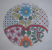
The last picture is my choice of the colors - may be for a wild, new bargello thing.
Anyway, this is a really fine and simple way to put together color schemes without wearing yourself out worrying about the color wheel. I taught color theory for many years - and it's great for mixing paint, and for understanding why colors will or won't work together - but for pulling threads for a new project, this is my favorite method - let somebody else do it.

Don't overlook catalogs that have fine bath towels and colorful sheets, etc. - great sources!! Even ads for drapery and upholstery fabrics.
I think one of my favorite color schemes that I used for several years, was an ad for sheets and towels in "Caribbean Colors." I had those tacked up on my painting lamp, and created sea shells, even other critters in these colors, as well as bargello projects for spring and on patchwork.
1 comment:
Girl,
You MUST be a mind reader! Color combining has been an ongoing "learning opportunity" for me. This is a perfect article and perfect timing!
Post a Comment