 I hear a lot of people lately wondering about how to put color schemes together - and a lot of talk about "analagous and adjacent and complementary" colors, etc. etc. - but this doesn't really help much in the matter of putting a pleasing combination together and choosing threads for a needlework project. Also, after choosing colors from a color wheel, there is the additional dimension to consider of value and intensity of the individual colors - and will they work well together? I had an intensive course in color theory with my interior design studies in college - and this has been invaluable in mixing paint colors, as it makes it soooo much easier and faster to create the desired color, and to make sure the colors work together. Also, it helps me in matters like ecclesiastical pieces, as I have to consider the effect of the light on surface colors as it comes through stained glass windows - adjustments have to be made for this.
 It also helps if one understands the effect of individual stitches on a piece according to the nature of the fibers - as for example, basketweave stitches break up light, and cause a color to be darker and duller than it would in long, flat stitches. Interesting effects - and they need to be considered when choosing threads. However, I still use just the visual thing to choose colors that are pleasing together - and get inspiration from many sources - I never sit down and decide to do an "analagous" color scheme. It's good to understand these things, but I still get my own color schemes from looking at nature, and other assorted sources.
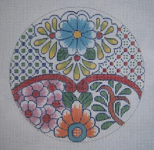
  I found these gorgeous pictures on the Thread Gatherer website (see this under "Good Stuff"), in which color schemes are ready made for needlework projects - this has fabric, so appears to be for a quilter. Great color combos! These I would definitely "borrow" from for maybe one of my crazy quilt pieces - and use the threads, as they are already put together!
 Another great place to get inspired is in catalogs for home decorating accessories - fabrics, etc. I find these in the Pottery Barn, Gump's, etc. - and sometimes in the clothing ones also. Look sometime at the stacks of colored towels so tastefully arranged for eye appeal - and also T-shirts are many time displayed that way. Trained professionals arrange these, so they are very attractive! I also remember Maggie Lane saying in her Needlepoint by Design that her favorite way to select a color scheme was to just dump all her yarn onto the floor, and the most amazing combinations appear. I do this a lot myself - and the important thing is, if the colors look good to your eye, there really doesn't need to be a complicated explanation via the laws of the spectrum and color theory for it. It's good to understand why, but not really necessary.
1 comment:
The bottom photo is my fav....love blues!
Post a Comment