Sunday, May 17, 2009

Anne's New Masterpiece is Framed!

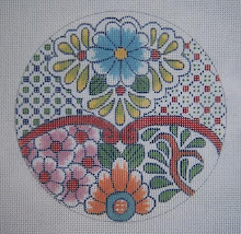
Anne Stradal is showing that wonderful black and white piece she did on her first stitching blog post - it has a really great story behind it, so if you missed it, scroll back to the beginning and watch the progress. I learned a lot by watching from beginning to end..
It's back from the framer now, and a piece to be proud of. See it at The Cape Stitcher.

Friday, May 15, 2009

The Art of the Background for Shaped Ornaments

I'll have to do this in two or three installments, as it could get rather lengthy - I intend to show step by step later how to effectively and easily stitch a basketweave background around a shaped ornament. I am seeing people really apparently struggling with it, and making it more difficult than it is.

A really competent finisher can do amazing things with the shaped ornament - I was mentored in this by Vikki Pinson here in Austin, who is fantastic at the art of fine finishing. I had no idea that one could actually have an intricately shaped piece finished without a wide band of background. She finished this cross for me in 1997, and was the first thing I did that was shaped and not on a rectangle.Notice that the background is very narrow - and is a dark purple, which contrasts beautifully with the colors on the cross.

There are two reasons for stitching background on shaped ornaments - one is to provide a seam allowance for the finisher, in which case a bit of it is going to show around the edges. I like to capitalize on this effect and make it a really nice color for edging. Ordinarily, two or three rows of stitching is enough.

I prefer my ornaments very lightly padded with a stiff back - rather than little stuffed pillow looking things, which are awkward and usually puckered around the edges. These look clumsy hanging on a tree or anywhere. For this reason, I add enough background color to show so that nothing is lost from the ornament itself. It's like a framework of color to further enhance the ornament itself.


This is a picture of Gail Hendrix's blowfish when I was adding the background - just illustrating the enhancing green, and the fact that the outline is added in three rows all the way around. (since it's stitch painted.)

The "jeweled" fish is my own design - an old one from my antique jewelry adaptation phase. Notice the dark green outline - it follows the shape of the fish closely, and showed up well on the finished piece as a colorful and enhancing outline on the edge. By doing this "background," no stitches from the fish itself were lost, and the shape was maintained.


The original piece of jewelry was red and green - so I changed it to blue, as I didn't want it to look like "Christmas."


The other reason for stitching background around an ornament is to give it a bit of added dimension - as sky or water or just a color to enhance the design itself.

The palm tree and parrot could have been stitched with less background and more nearly the shape of the design, but I wanted the color and definition a bit larger.


Again, here is the jewelry from which I adapted the parrot.


The starfish could have been left with only the darker green background, but I wanted the "sea water" also around it for more color. I'll add another chapter to this in a day or two, and deal with the actual stitching how-to of proper basketweave around a shape. It's actually quite simple if you've been taught correctly.

Meanwhile, also check out the other blog (Freebies, etc.), as I have some small crosses there I found that were drawn years ago for individual personal prayer cushions. People have been asking for patterns and ideas for these lately.
ADDENDUM: While looking through my bead files a little while ago, I found this small starfish ornament I made for Vikki several years ago. I can see where I painted out the outline I had originally made for the background, as she said she only needed a few rows for finishing.

You can see how intricate the outline is, and how effective it is to leave the ornament in it's actual shape. It finished quite well as a starfish with hardly any background showing. (This one was done with my technique which makes it look beaded solid.)


Wednesday, May 13, 2009

Patchwork Progress: A Variety of Threads

The patchwork background stitching is finished, and only lacks the surface enhancement and definition of the Memory Thread (DMC). I won't have time to take a picture when this is done, as it has to be shipped yesterday!!

The surface texture effects are amazing - even among just the cotton threads, which include Pearl cotton, floss, and the Variations Peal cotton. Then the shine of the rayon (Satin Floss) really shows up beautifully.

I was careful, in this case, to place the stitches so there were no "ragged" edges so that the Memory Thread could be added smoothly. This shows up well on the pink triangles of Satin mosaic stitch where it ends against the orange "V."


In this photo, the M. thread isn't tacked down, but I wanted to show the wonderful definition it will give when outlining the V's. The burnt orange color really shows up well, whereas I think it would have been lost if I had used the original idea to do the same color in cotton floss for the backgrounds.

For those of you who aren't aware, DMC has a wonderful web page for browsing and shopping in case you can't find what you need at your LNS.


Thursday, May 07, 2009

Patchwork With DMC: Showing New Threads!!

DMC has some new threads, and also one that won't be available until mid June, when they show it at market (TNNA). Meanwhile, they sent me a picture of a patchwork thing they want to use to show what can be done in needlepoint with their threads.

I had no idea they had so many different things - lots are new to me, but some are just new period! This is a picture of the 5" square design on canvas - I got lucky the first time when I plotted it out, and it came to exactly 5" square!

Next is the brand new one that was developed for paper crafting, but the ladies in marketing and product development are both needlepointers, and are sure it can be used - one has already done an awesome canvas involving black wrought iron that is quite dimensional with the Memory Thread couched over the stitching. This is a bit beyond my skills, but I'll give it a try. It is a soft, thread wrapped wire, so it's packaged on little clear plastic spindles to keep it neat. Pretty colors, and there will be more.


Nothing, of course, turns out as we see it in our heads - so I was prepared for some errors in judgment and ripping out. What I thought was being extremely clever with the Variations pearl cotton - the overdyed thread on the big X, didn't work at all, as I failed to consider that although I work Nobuko horizontally, trying to work it in the opposite direction on the other side of the X caused it to have a vertical orientation. Had to rip it out.

I was told to use the Lumiers, or "Light Effects" (new to me) as blending filament with the purple Satin Floss in this square, but I hated to lose the beautiful variegation in the metallic - so changed it to Smyrna cross, and then Mosaic for the purple parts. Rather effective, it is! I love this stuff - as it's plied like floss, I was able to use 4-ply to make the stitches.


Another change I made was in the threads included in the package for greens - both were entirely too low intensity to look right with the other brighter colors. They turned to mud. I did use pearl cotton for the dark green, but used good old reliable floss in T-stitch for the light green. (It's good to have a big stash) The turquoise square is simply basketweave, as it will be embellished with couched Memory thread in the same color.

Notice how shiny and pretty the light pink is - Satin Floss!! This is a new thread to replace the old Rayon floss that was so difficult to work with. It's been discontinued. The Satin Floss is slippery, as it is rayon - but I use it as I do the floss with a slip knot against the eye of the needle, and have no trouble at all with it.
On the close-up of the orange elements - notice that it is the same thread - Satin Floss, but in basketweave it is darker and duller because of the light being broken up on the surface. The center square is stitched in T-stitch, so has the longer stitches to reflect light, so appears much lighter and brighter. This is always a consideration when choosing threads - the stitch itself makes a difference.

The orange X's and the center square will be embellished with burnt orange Memory Thread to give them more definition. More on this in a few days - I have a deadline here, and have to do more stitching than blogging.

Wednesday, May 06, 2009

Personal Prayer Kneeler: an idea!

There seems to be a lot of interest in personal prayer kneelers right now. I was just looking through some old pictures from my wholesale line, and found this I had forgotten about. It's actually a small prayer book or Bible cover - and I did so many I got tired of painting them and discontinued it. (for shops in Houston and Ft. Worth)

I do remember several years ago doing a personal kneeler for a woman, using the William Morris grape vine around the edges, and three simple, outlined gold crosses in the center space. (where the one vertical one is on the book cover.) With this, I'm just throwing out an idea for designing your own personal prayer cushion - lots of options here.

Monday, May 04, 2009

Animal Skins: A Timeless and "un-trendy" Elegance

Isn't this guy totally gorgeous?!! He's a Jaguar from the jungles of South America. I've had this picture and the following ones in my "animal skins" filing cabinet for several years, and just now have dug them out, as I was looking for my other drawings I've now used as "traceable patterns."

I haven't used the jaguar spots yet, as they are large compared to the leopard, and also have spots within their spots - too big for my little mini-stockings, etc., but would be gorgeous for a big sofa pillow. My original idea was probably to just paint the whole picture onto needlepoint canvas - but I am old and lazy at this point, and will never get it done - either drawn, painted, or stitched.

As I have used animal skins for many many years as patterns for painting (flower pots, candles, small pieces of furniture as well as needlepoint designs) I have no recollection of where I found the pics.
This cheetah pillow is beautiful, I think- and I would love to do a large canvas mesh sofa pillow with the design and colors. I use cheetah a lot on small pieces, as it is so adaptable and easy with the little random spots and patches. My favorite threads for it are the Petite Very Velvet (18 mesh canvas), as it looks when stitched in basketweave, quite velvety.

I have never intended for this blog to be commercial or for marketing of my designs - but rather to pass along my own knowledge and experience, etc., as well as that of others I meet on the internet via blogs and web pages - and to learn from other people too.

However, I have had a lot of interest on the "Freebies, etc." blog in the animal skin projects I put there, and have had requests for larger, traceable animal skin patterns. I have now accomplished an "e-pattern" booklet on my web page, Elegant Whimsies, as I can't give them all away - after all, I have to buy needles and beads and canvas and paints and brushes and wonderful fibers for creating this stuff and keeping it going. Did I mention beads and more beads?
This Tiger and Leaf pillow is another picture I had cut out - probably in a home accessory catalog or a decorating magazine. I did something similar about 25 years ago, but used leopard on the border, and surrounded the center with very loose looking caladium leaves. There was a monogram in the center, I think.

Animal skins do wax and wane in popularity as decorative items and for clothing, but they never really go "OUT" or become "trendy" as the sunflower did in the mid 80's. Nature is incredibly beautiful, and my own interest in the animals and leaves never goes away..

Saturday, May 02, 2009

A Framed and Finished Masterpiece!

I've shown this small rug before in various stages, but Jan has now brought it home from the framer, and it is absolutely gorgeous! She has the character and perseverence to actually finish projects.
I am a process person, and rarely finish anything. If I do, it languishes in a box for a few years until I find it again and find a use for it. Jan is both a "process" and a "product" person. This takes character and perseverence that I don't have.
Anyway, do go visit Jan Fitzpatrick at her beautiful blog, "Thread Medley" - and don't forget to also click on her other page to see her "Adaptations" and explanations, as well as yummy pictures and patterns.

Friday, May 01, 2009

Prayer and Altar Rail Kneelers: chapter III

I haven't really a lot more to say about the St. Andrew's kneelers, but did want to show the rest of the pictures - at least the ones I didn't manage to erase from the memory card. I am not good with mechanical and electronic devices - and that includes my little Kodak camera. This, of course, is the center cushion - St. Andrew's cross.

I had forgotten some of the artwork on these - I don't like having everything totally matching, as it takes away the handwork aspect of the art, and would make it less personal. I do all of my drawing freehand - nothing by computer. ( I don't even know how to produce art by computer.) To explain this comment - I drew the original working master pattern freehand - but then traced it onto each canvas with my drawing pen. I never draw directly onto the canvas - that would create disaster. Big mess, etc.

This one has the two clusters of grapes on the right side, and the shield has the curled edges at the top. Some of the kneelers - such as the two end ones, have plain shields and only one cluster of grapes on each side. I finally remembered that this was done because they are shorter than the central 13 designs.
Bad light again here - I have no idea who this is - a chalice with a snake. My books are all packed in boxes in the garage, but it's worth looking it up, as I'm rather curious. There are a few others that I don't recognize, also

Another dark one, but if you click to enlarge, you can see it better. Again - I don't know who this is.

St. Matthew is obvious, with the open book.
When I arrived, St. Peter was displayed upside down - as someone didn't remember that he was crucified on an upside down cross. I turned the picture the correct way when I put it into the computer - but did turn it before I left the chapel. On this one, you can see the curled edges of the shield more clearly. This is all I managed to get home with - I'll have to do it again, but with a better photographer than I am, and some decent lights.

This is all for St. Andrew's - I'm waiting now for pictures of work I've done for Church of the Good Shepherd here in Austin, and also St. David's. The Celtic knotwork was delightful to work out! (St. David was from Wales)

Also, I think a trip to Tallahassee is justified (wooo hoooo!) to see my altar rail cushions at Church of the Advent. Those go all the way around the altar - and have curved corners so that they may be changed with the seasons. The main, recurring theme for those was the wheat and grapes - and I used native flora and fauna of the state that have religious symbolism - like the butterfly and the dogwoods.

Thursday, April 30, 2009

Altar Rail/Prayer Kneelers: next chapter

I had to have a picture of this window - they are all the way down both sides of the beautiful chapel at St. Andrews. These two saints - Francis and Clare are my favorites. St. Clare is the patroness of needlework, as she sought refuge with St. Francis when she was hiding from a suitor her father had chosen for her. St. Francis helped her establish the Order of the Poor Clares, and their work was embroidering altar cloths. I have painted her on needlepoint canvas, but have now lost the pattern.

You can also see the beautiful stained glass in almost its true cobalt blue color. When I first saw the chapel at the very beginning of this project, the only window that was placed was the big one on the east wall behind the altar.

Again, the light was dim when I was out there on Wednesday, but you can get the idea of the grandeur of it. When I first saw this, I knew I had the background for my kneelers. There are the stylized grapes and leaves you see on the finished pieces, plus the delightful texture of the "cobblestones."

There is a difference between altar rail kneelers and individual prayer kneelers, in that the space has to be considered in front of the rail, and the size and number of cushions are largely determined by this. An individual prayer kneeler only has to fit the prie dieu if there is one, or just be the size the person wants.

The color is really bad looking on this one - St. Jude, who is my very favorite of the Disciples - the patron saint of Miracles and Hopeless cases. I think the flash on my camera took over here.

I don't remember whose idea it was to use the disciples as the theme - but with St. Andrew for the center, it seemed a good idea. Marilyn Sheneman and I worked together on this project, and it was a wonderful experience. She made me laugh a lot.

To get started, I had to measure the entire space in front of the altar where the cushions would be placed - to get the measurements right for the canvases. This altar rail is very very long, so I had lots of space to fill. I knew I wanted that Star of David, and also wanted to put the Alpha and Omega at the end, but couldn't fit it into the shield format - so opted for the Chi Rho monogram.

I had the measurements all settled in my head, when someone informed me that there were 13 disciples, as Judas was relieved of his duties after the 30 pieces of silver episode. So - back to the drawing board to shorten the cushions and add another. 15 in all!!!

As they are about 30" long, you can imagine the size of this space. Sorry - bad lighting again. I did extensive research, as I have done for years, on the lives of these men, their work, and in some cases their martyrdom - from whence come their symbols.


Right now I can't remember a lot of it, as it has been almost ten years since I did this. I have no idea why there is a rope forming the "J" but I'm sure there's a reason. The 30 pieces of silver are obvious. The next step was to go home and make zillions of sketches on white drawing paper, which I buy in rolls. - then refining the drawings to size on tracing paper, and inking the patterns.


This is how it begins when designing kneelers for the Communion rail. One must look at the surroundings - the stained glass, consider the name of the church, all of that - and then select a theme and the colors, being aware of the color of the light that comes through the windows. One does well to have continuity in the backgrounds that will tie them all together. More on this later - and more pictures.

Wednesday, April 29, 2009

Prayer Kneelers and Adaptation: St. Andrews in Austin

This is just a quick preview - I have just returned from the St. Andrews Upper School Chapel here in Austin, for whom I designed 15 altar rail kneelers about nine years ago. I had never seen them stitched, finished and in place, nor had I even seen the chapel since the glass was installed and the interior finished. It is a joyful and uplifting place, and especially appropriate for high school students. Absolutely beautiful, and I was actually proud of my work - which is rare.

Anyway, I plan to do several posts regarding the adaptation of a theme to prayer kneelers, etc. and how to get ideas and get started. Not today, however, as I have earned a break of a few days (I think)

The first illustration is the "Christ the King" monogram - the Chi Rho with the crown. It's the far end of the 15 kneelers, and the truest colors - It's a drab, cloudy day here in Austin today, and the light wasn't good, but this is about the color of the stained glass window behind the altar on the east wall, which is where I got the inspiration for the backgrounds of these pieces.

The Star of David is at the beginning - the far left end of the rail. I thought it a great idea, as the Disciples are in between, and Jesus was a descendant of The House of David. Also, Michael Dell's children were attending the school at that time, so I thought it especially suitable and appropriate for that reason too. He had donated also a beautiful building to the school - a very generous and civic minded man.

ADDENDUM: I have already had someone comment by e-mail that she likes the color on the top illustration best. To explain - they are all 15 stitched with the same threads, same dyelot. They went to The Yarn Barn of San Antonio, to Bobbi Ravicz, who then owned it, and who has threaded all of my ecclesiastical work (even Church of the Advent in Tallahassee) for the 35 years I've been doing it.

The difference in color is because I was armed with my trusty little Kodak, which I am too dumb to know how to use well, and the faulty light today, as we are cloudy and overcast. This is also a thing one takes into consideration when designing church pieces - the colors in the stained glass, with the light coming through, can drastically alter the way the threads look.

Sunday, April 26, 2009

Names on Stockings: How To (a tutorial)

As long as I had committed to do this stocking cuff for a very dear friend, (few get this privelege these days, as I am old and crabby and lazy) I decided to do pictures of the stages I go through when doing the job. It's actually a very simple process, but exacting, and takes a bit of time if it's done right.

Avery is one I did for a great granddaughter of this delightful lady several years ago. Now there is a baby brother, whose name is "Griffin." As the letters of the Avery alphabet are wide, I couldn't possibly make them work for Griffin - and actually, I don't like things all matched anyway. The stockings are by the same designer, so the continuity is there.

The canvas mesh is 13, so I decided that a simple lettering would fit best, but couldn't just do block letters - time to make one up. Here you can see the blank cuff.

The first step is to trace the shape of the cuff onto a piece of tracing paper with black ink, and then roughly draw in letters the size they need to be. Then, go over them with black ink to make them easy to see under needlepoint canvas. I always do this first as a pencil sketch - then ink that. In this case, the penciled letters were too big, so I made them smaller when drawing in the ink. On the "G" I started playing with a style instead of block letters.

The next step is to put this under a piece of scrap canvas, and start creating letters - which have to be the same height and width, and have the same number of threads between them. Actually an easy thing to accomplish once you get the hang of it.

I didn't like the first attempt - at the top - as the letters are too narrow. Soooo I tried again at the bottom with a different count, and like it much better. On the bottom version, you can see where I counted for centering. Just mark every 10th thread to the end of the name - There are usually a few threads left after the last 10. In this case, 4 - which left me with an even number.

At this point, I counted by 10 + 4 to find the center. There were 94 threads, so the center is in the groove between threads (even number). On an odd count, one would mark ON THE THREAD.I simply counted over 47 stitches, and marked the center. Next in this process is to find the center of the cuff - by just measuring the line that separates the cuff from the body of the stocking, and then marking the center - corresponding with the odd or even count.

From here, I placed the stocking over the lettering to determine the vertical placement - always leaving less space at the bottom than at the top, as the name needs to visually "rest" and not float away. Then it's a simple matter to just copy the lettering count, beginning at the center. These letters are 29 stitches high, but it's only necessary to count this once. This is the "F" just to the left of the center in "Griffin."


All done now - and I always paint these in grey when doing them for other people, as mixing paint takes time, and it also gives them leeway for choosing colors of thread.

I am planning to do another tutorial on putting names on mini-stockings (may be applied to full size ones as well) on my "Freebies, Etc." blog - probably not tomorrow, but soon. For that one, I'll use more decorative alphabets I've either made up myself and use a lot - or from my favorite books (two of them). Stay tuned!

Friday, April 24, 2009

Painted Canvas with Beads II: By Mindy

This lovely Asian canvas by Mindy is the second one I purchased at the trunk show a long time ago, and just didn't quite know what to do with it. As with the Art Nouveau piece, I'm glad I waited, as I've found other threads I wasn't aware of at the time.

One I am enjoying now is the beautiful and subtle Kreinik Vintage - the gold #002V. A shinier one wouldn't do on this.

The design is a gorgeous abstract of a stream with water plants, I think - and the main beauty is the color. The turquoise "stream" certainly needs to be jazzed up a bit, but textured stitches would totally ruin the effect of the lovely Asian fretwork and subtle shading. Nothing should be added that would compete with it.

As with the Art Nouveau canvas, I believe just the clear beads will add what it needs. Plain basketkweave would be boring with all that gold diaper pattern.

When I first chose threads and beads for the Art Nouveau, the beads were a great match for the threads (DMC floss), but as I got started, I realized that the colored beads would be a further distraction;, so simply opted for using my favorite effect - the clear Sundance #250 beads. By applying them with the same floss as each background patch, they appear to be the same color.

You can see where I placed the ink dots for the beads - they are, on the diagonal, two stitches apart, and on the weft threads (the dips). Basketweave is worked around them, and then the beads are added.
ADDENDUM: The evening I did this post, Blogger was having a major problem, and only dogged determination kept me going to almost finish it. What I failed to tell was that I used #5 perle cotton in white for the outlining on the border, as the little "ropy" effect makes a shine that causes the white to show up well.
Also, I used dark green beads in the dark green areas on the border, as I used my "beaded solid" technique, and I like the irridescent-but-not-sparkly look of these beads.
I will do a better close-up as it progresses, as this picture of the clear beads in place on the cream and the green patches doesn't show the total effect. In person, it is subtle, and looks great!


Monday, April 20, 2009

Fish Rubbings and Japanese Art

I was looking at this web page this morning, hoping to choose what I want this summer, as my son and his family spend a great deal of it on Cape Cod (at Brewster) - and usually bring me back something gorgeous in the way of a new T-shirt to enhance my wardrobe.

These items, which include a lot more than T-shirts, are made by an old Japanese method of printing with inks right from the sea creature itself (Gyotaku) - a fascinating technique, which is explained on the web site.

The colors used by this company are really gorgeous! My favorite is a pair of bright pastel scallop shells - but I can't find it right now for illustration. Probably in the laundry basket unironed.

Anyway, Cape Cod is certainly interesting - I used to order great candles at wholesale there (Colonial Candles of Cape Cod) when I was in my accessory painting phase, and painting wildflowers for the Lady Bird Johnson Wildflower Research Center - and also Impressionist interpretations for a gift store here in Austin. (Breed & Co.) Painted candles are great decorative items! (More on that later.)

Also, Anne Stradal lives there now, so if I hitch a ride to Brewster this summer with my son, I could go visit her and see the lighthouses in person, and she swears she makes a great omelette- what fun to look forward to. Meanwhile, do go visit Blue Water Fish Rubbings and enjoy!

Saturday, April 18, 2009

Adaptations for Needlepoint

Jan Fitzpatrick's new website is finally "live" this morning - and will be another wonderful diversion and learning experience for those of us who are interested. She will go into detail as she designs new pieces, explaining why the source interests her in the first place, how she researches, and then adapts the designs to needlepoint. Choosing threads and colors will also be part of it.

The illustration here is a newly finished "tile" which is one of her favorite things. Jan's work is counted and charted, which fascinates me, as I could never get the hang of it when I wanted to do the Persian rugs and Kilim weaves.

I'll really enjoy watching this, as well as her blog, as it's great design work, and so different from my own painted canvas designs. Berber rugs and Moroccan ceramics and textiles seem to be her favorite source, in addition to the charming traditional patchwork coasters she has made - I think instructions are now available for several of those. Do go and look at this great site: www.threadmedley.com

Monday, April 13, 2009

Antique Jewelry and Bugs (in needlepoint, of course)

Artists and artisans, since the beginning of time, have looked to the wonders and beauty of nature for inspiration. This has been so true for me, as things other designers do - like Santas and witches, etc., just "aren't in my head."

A number of years ago, I found in one of my antiques magazines, several pages of gorgeous "critters" in jewelery form - antiques, of course. The earliest form of using bugs for jewelry was in ancient Egypt, where the Scarab was developed - the dung beetle - to help one across the "river" into the next life.

Then during the Art Nouveau period, there was quite an explosion of beautiful bugs in jewelry. These have really appealed to me as inspiration for design - so I've done beetles and butterflies and also fish. I don't remember where I found the first picture - I don't think it's an antique, so is copyrighted and will not be available commercially as a needlepoint design - but I wanted to show it, as it's a splendid and simple piece for demonstrating how this is done. I'll do a tutorial on it later when I have more time - not tonight!

The idea has grabbed me again, so of course I ordered a book, which I look forward to receiving!!

I think a lot of the appeal for me has also been the new sparkling threads, which appeared during the ten years or so I was doing other things. When I re-joined the needlepoint world - there they were! In this picture, I'm seeing one of my favorite combinations, the turquoise, malachite, and lapis lazuli, which would be gorgeous stitched with the DMC Satin Floss - high sheen but without sparkle.

I have just posted a pattern for a "jeweled" ladybug and an enameled beetle on the other blog, Freebies, etc. I thought it timely, as Jake discovered this evening that his ladybugs have not left the homestead, but are busily munching pests on his mama's geraniums and Gerbera daisies.

Thursday, April 09, 2009

Lots of Bugs and a Granny's Duty

It is a grandmother's sacred duty to wreak havoc and create pandemonium whenever possible with the grandchildren. I do it well, as did my grandparents and my parents. I think it's called "payback time."

Anyway - I went out yesterday in search of the perfect birthday gift, which was a package of ladybugs, as Jake Brenner is six today, and has been studying these critters at school. I thought perhaps they would come in a nice little package of 50 -100 bugs, but no. 1500 bugs, with 300 extras "just in case of high mortality."

A friend drove me, as I've been ill and couldn't drive myself - so we also stopped at the nearby supermarket. It's hot in Austin, so I had to take the bag of bugs, disguised in a plastic grocery bag, into the store. The cashier wanted to know what was in the bag (had I been shop lifting?) She nearly fainted when I pulled out the little net bag with the bugs crawling everywhere.

I didn't know it, but these things are kept in the refrigerator until ready for release, but heat wakes them up - so they were fully awake and crawling everywhere. I put the bag into the refrigerator when I got them home, and am grateful that my daughter is a good sport (she has four brothers).

When I pulled the bag out last night and gave it to the little imp, the expressions on his face were priceless when he realized it was full of bugs, alive and well - worth all of it!! The second picture is of the bugs in the bag awake and crawling - and on top of the cake box. (still in the frig.)

He and his daddy released them tonight after dark, as we were instructed - but there was a lot of howling and whining about wanting to keep them as pets. Oh dear. hee hee hee

I think tomorrow I will try to find my file of "jeweled" ladybugs on needlepoint canvas and post them as "Freebies" on the other blog. I know there is one I did from the Faberge mini-egg of a ladybug with diamonds.